188 Data Scientist Interview Questions & Answers

92 top • 12 Amazon • 15 Apple • 13 Google • 12 Meta • 15 Microsoft • 15 Netflix • 14 NVIDIA

Data Scientist icon

Questions with Detailed ExplanationsWith Detailed Explanations

(Last Updated: September 8, 2026)

21. What is exploratory data analysis, and what should it establish before modeling or decision-making?Data Analysis And Product SenseEasy

Question Details

Define exploratory data analysis and describe a practical sequence for checking data grain, types, missingness, duplicates, distributions, outliers, relationships, segments, time patterns, and possible leakage. Explain which findings should become data-quality fixes, follow-up questions, hypotheses, visualizations, or constraints on later analysis.

Short Interview Answer (30-60 seconds)

EDA is how I understand and validate data before using it. I check the grain, types, missingness, duplicates, distributions, outliers, relationships, segments, time patterns, and leakage. It should reveal data-quality problems, useful patterns, open questions, testable hypotheses, helpful visualizations, and constraints for later analysis.

Detailed Explanation

Exploratory data analysis, or EDA, is the first structured examination of a dataset before modeling or making a decision. Its purpose is not only to make charts. It should establish what one row represents, whether the values are usable, which patterns deserve investigation, and what risks could make later conclusions misleading. A practical EDA checks grain, types, missingness, duplicates, distributions, outliers, relationships, segments, time patterns, and leakage. Its findings then become data-quality fixes, follow-up questions, hypotheses, visualizations, or explicit constraints on later work.

Useful Questions to Ask the Interviewer
  1. What does one row represent, and what is the intended unit of analysis?
  2. Which fields are expected to be unique identifiers, categories, dates, or numeric measures?
  3. Are there known data-quality issues, source-system changes, or periods with incomplete data?
  4. Is there a future outcome or decision this analysis may later support, so I can check carefully for leakage?
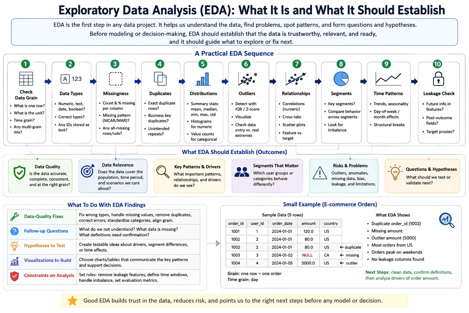
What is exploratory data analysis, and what should it establish before modeling or decision-making? diagram
How to Explain It in an Interview

I would explain EDA as an ordered validation and learning process.

First, I check the data grain. Grain means what one row represents. In the diagram's order example, one row is intended to represent one order, and the stated time grain is day. I verify the business unit, time unit, identifiers, and whether different grains have accidentally been mixed. If the grain is wrong, later counts, averages, joins, and model labels can all be wrong.

Second, I inspect data types. I check whether numeric, text, date, Boolean, identifier, and categorical fields are stored as the intended types. An identifier stored as a number should usually not be treated as a continuous measurement. Dates stored as text may also need parsing before time analysis.

Third, I measure missingness. I count missing values and percentages by column and look for patterns rather than treating every missing value the same way. Missingness may indicate a collection problem, a field that is not applicable for some records, or a segment-specific issue. The reason for missingness determines whether I should repair the data, exclude records, represent missingness explicitly, or ask a follow-up question.

Fourth, I check duplicates. I look for exact duplicate rows, repeated business keys, and unintended repeated records. In the diagram's small order example, order_id 1002 appears twice with the same values, so I would investigate whether it is a true duplicate before aggregating orders. Duplicate records can inflate counts, sums, and frequencies.

Fifth, I study distributions. For numeric variables I inspect summary statistics such as mean, median, minimum, maximum, and standard deviation, together with histograms or similar plots. For categorical variables I examine value counts. This establishes typical values, spread, skew, rare categories, impossible values, and whether averages are representative.

Sixth, I investigate outliers. I can use simple rules such as the interquartile range or z-scores as flags, but I do not automatically delete flagged observations. I visualize them and compare them with data definitions or domain rules because an extreme value can be a data-entry error or a real, important event. In the diagram, an order amount of 5000 is treated as an outlier that should be investigated rather than silently removed.

Seventh, I examine relationships. For numeric variables I may inspect correlations and scatter plots. For categorical relationships I may use cross-tabs or grouped summaries. If a future target exists, I can compare candidate features with that target, but I keep correlation separate from causation. A strong relationship is a clue to investigate, not proof that changing one variable will cause the other to change.

Eighth, I analyze meaningful segments supported by the data, such as customer groups or countries when those fields exist. I compare behavior across segments and look for imbalance. Segment analysis can reveal that an overall pattern is driven by one subgroup, but very small segments can produce unstable conclusions.

Ninth, I inspect time patterns when timestamps or dates exist. I look for trends, seasonality, day-of-week or month effects, structural breaks, and unusual spikes. Time ordering matters because future information must not influence an analysis that is supposed to represent an earlier point in time.

Tenth, I check for leakage. Leakage means using information that would not legitimately be available when a later model or decision is made. I look for future information, post-outcome fields, or variables that are effectively proxies for the outcome. A leakage feature can make historical analysis or model evaluation look unrealistically strong.

After these checks, I summarize what EDA has established. I want to know whether the data is accurate enough, complete enough, consistent enough, and at the right grain for the intended analysis. I also want to know whether the dataset covers the relevant population, period, and scenarios; which important patterns and relationships appear; which segments behave differently; and which risks, limitations, anomalies, or possible leakage remain.

I then turn findings into specific actions. Confirmed data-quality problems become fixes such as correcting types, handling missing values, removing confirmed duplicates, correcting errors, standardizing categories, and aligning grain. Unclear definitions or unexplained patterns become follow-up questions. Plausible explanations become hypotheses to test rather than conclusions. Important distributions, relationships, segments, or time trends become visualizations. Known limitations become constraints on later work, such as removing leakage features, respecting time windows, handling imbalance, or choosing evaluation metrics that fit the problem.

Using the diagram's e-commerce example, I would first confirm that one row means one order. I would flag duplicate order_id 1002, investigate the missing amount, and examine the amount of 5000 as a possible outlier. The diagram also shows that most sample orders are from the US, states that orders peak on weekends, and reports no leakage columns found. The weekend pattern cannot be established from the five displayed rows alone, so I would treat it as a finding from a broader time analysis that still needs enough historical coverage to validate. These observations do not by themselves prove why order amount changes. The next step is to clean confirmed data problems, confirm definitions, and then investigate possible drivers with appropriate visualizations and hypotheses.

The main principle is that good EDA builds justified trust in the data. It reduces the chance of modeling a data error, explaining an artifact as a real pattern, or making a decision from information that would not actually be available.

Technical Approach
  1. Define the observation grain: state exactly what one row represents, the relevant entities, and the time grain.
  2. Validate data types: identify numeric, categorical, text, date, Boolean, and identifier fields and find incorrect representations.
  3. Measure missingness: count missing values by field and inspect whether missingness follows a pattern.
  4. Check duplicates: detect exact duplicate rows and repeated business keys, then determine whether they are legitimate repeats.
  5. Examine distributions: calculate useful summaries and visualize numeric distributions; inspect categorical value counts.
  6. Investigate outliers: flag extreme observations, visualize them, and distinguish data errors from real events.
  7. Study relationships: inspect correlations, cross-tabs, scatter plots, and feature-to-target relationships when a target exists, without treating correlation as causation.
  8. Compare supported segments: look for different behavior and imbalance across meaningful groups.
  9. Inspect time patterns: check trends, seasonality, calendar effects, spikes, and structural breaks.
  10. Check leakage: identify future information, post-outcome fields, and target proxies that would not be available at the intended decision time.
  11. Classify findings: turn confirmed errors into data-quality fixes, uncertainty into follow-up questions, plausible explanations into hypotheses, useful patterns into visualizations, and known risks into constraints on later analysis.
  12. Reassess readiness: proceed only with a clear statement of what is trustworthy, what remains uncertain, and what limitations later modeling or decisions must respect.
Practical Insights

EDA has no single fixed computational complexity because each check has a different cost. Basic summaries, missing-value counts, type checks, and duplicate scans are often roughly proportional to the number of rows and columns. Pairwise relationship checks can become much more expensive when there are many variables because the number of variable pairs grows quickly. Segment and time analyses can also become costly with high-cardinality categories or very large datasets. The practical tradeoff is depth versus speed: start with broad, inexpensive checks, then spend more computation and analyst time on suspicious fields and important relationships. There is also a statistical tradeoff. Searching many segments or correlations can produce patterns by chance, so EDA findings should usually generate questions or hypotheses rather than automatic causal conclusions.

Why Interviewers Ask This

Interviewers want to see whether the candidate knows how to understand and validate data before drawing conclusions. A strong answer shows disciplined reasoning about grain, data quality, distributions, relationships, segmentation, time behavior, leakage, uncertainty, and the difference between an interesting pattern and evidence that is safe to use for a model or decision.

Common interview mistakes

Common mistakes are starting with correlations or a model before defining the data grain; assuming stored data types have the correct analytical meaning; dropping every missing value or outlier without understanding why it exists; checking only exact duplicates while ignoring repeated business keys; relying only on averages and missing skewed distributions; treating correlation as causation; slicing into many small segments and overinterpreting noise; ignoring trends, seasonality, or structural breaks; using future or post-outcome information and creating leakage; and producing charts without translating findings into fixes, questions, hypotheses, visualizations, or constraints.

Interview tip

Present EDA as a sequence with a purpose, not as a list of charts. Start with grain and data quality, move to distributions, relationships, segments, and time, finish with leakage, and explicitly say what each finding becomes next: a fix, question, hypothesis, visualization, or constraint.
Interviewer may ask next
How would you handle an extreme value during EDA if you do not know whether it is an error or a real observation?

I would not delete it automatically. I would first verify the data type, units, source record, and any valid range or domain limits. Then I would visualize the value in its distribution and compare it with related records and segments. If it is a confirmed data error, it becomes a data-quality fix. If it is a legitimate rare event, I keep it and document its effect on summaries and later analysis. If I cannot determine which case applies, I treat it as an open question and test how sensitive conclusions are to including or excluding it.

What would change if you discover that a strongly predictive field is created only after the outcome occurs?

I would treat that field as leakage for any model or decision that must be made before the outcome. I would remove it from the allowed feature set or enforce a time boundary that prevents future information from entering the analysis. I could still study the field descriptively if useful, but I would not use its predictive relationship as evidence that a deployable model will perform well. I would then repeat the relevant EDA and later evaluation using only information available at the intended decision time.

22. Define a north star metric for a food-delivery product.Data Analysis And Product SenseEasy

Question Details

The product goal is to create repeat customer value through successfully fulfilled food orders. Define the user and order observation units, active-user denominator, geographic and weekly time window, and a north star metric. Decompose it into measurable funnel or frequency drivers, name guardrails for customer, courier, restaurant, and unit-economics health, identify required events, and state which product leader would use the framework to prioritize a lever.

Short Interview Answer (30-60 seconds)

I would use Weekly Repeat Order Rate: active customers with at least 2 successfully fulfilled orders in a rolling 7-day window divided by active customers with at least 1 fulfilled order. I would then diagnose it through funnel, fulfillment, repeat, and frequency drivers while protecting customer, courier, restaurant, and unit-economics guardrails.

Detailed Explanation

The goal is repeat customer value through successfully fulfilled food orders, so the north star should measure successful repeat ordering rather than app activity alone. I would measure customers at the user level and individual food orders at the order level. Within one city or market and a rolling 7-day window, an active customer has at least one successfully fulfilled order. The north star is Weekly Repeat Order Rate: the share of those active customers who have at least two fulfilled orders. I would then connect it to measurable drivers, guardrails, required events, and a product decision.

Useful Questions to Ask the Interviewer
  1. Should WROR be reported separately for each city or market, or also rolled up across markets?
  2. What exact business rule makes an order successfully fulfilled, especially for cancellations, refunds, damaged orders, or very late deliveries?
  3. Should the rolling 7-day metric be refreshed every day, or reported on a weekly cadence such as every Sunday?
  4. Are the guardrail thresholds already established operating targets, or should I treat the values shown in this framework as example thresholds?
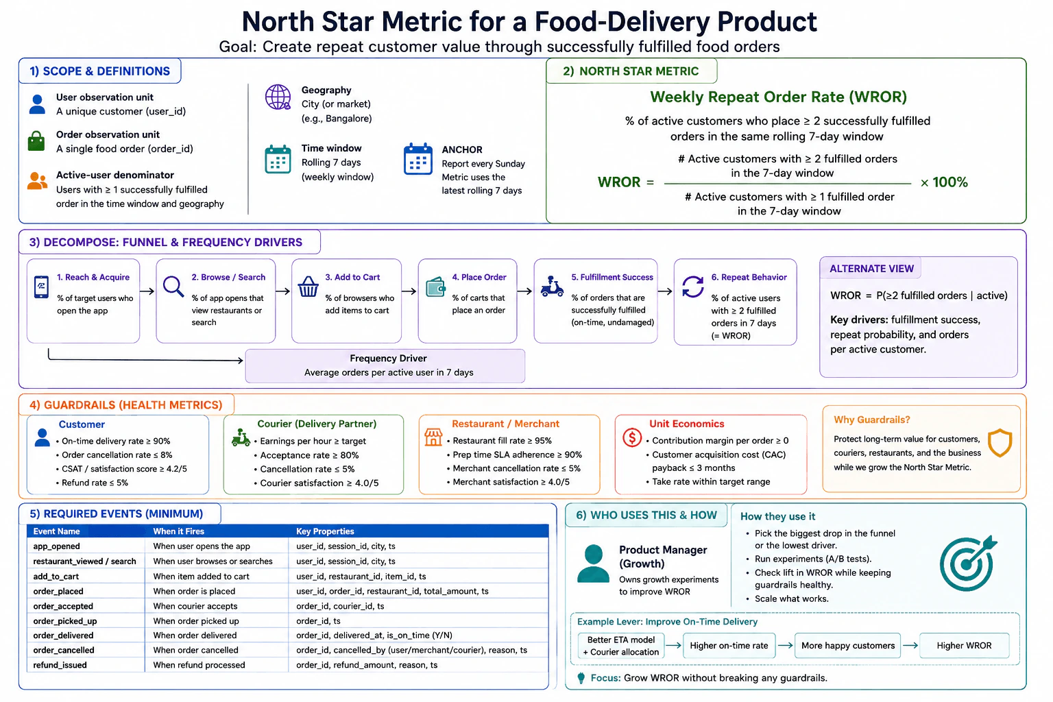
Define a north star metric for a food-delivery product. diagram
How to Explain It in an Interview

Start with the product goal: create repeat customer value through successfully fulfilled food orders. The north star should therefore reward both successful fulfillment and repeat behavior.

The user observation unit is one unique customer, identified by user_id. The order observation unit is one food order, identified by order_id. Keeping these grains separate prevents an order count from being mistaken for a customer-level rate.

Choose one geographic unit, such as a city or market. The diagram uses Bangalore only as an example. Calculate the metric within that geography rather than automatically mixing markets that can have different demand, supply, delivery conditions, and operating characteristics.

Use a rolling 7-day window. The metric may be reported every Sunday, but each report uses the latest rolling 7 days. A consistent market-local timestamp convention should be used when assigning events to the window.

Define an active customer as a customer with at least 1 successfully fulfilled order in that geography during the rolling 7-day window. This is the denominator population.

Define Weekly Repeat Order Rate, or WROR, as:

WROR = (active customers with at least 2 successfully fulfilled orders in the rolling 7-day window) / (active customers with at least 1 successfully fulfilled order in the same window) × 100%.

Equivalently, WROR is P(≥2 fulfilled orders | active). The numerator is a subset of the denominator, so the population is internally consistent.

Next, decompose WROR into measurable funnel and frequency drivers. The funnel shown in the diagram is: reach and acquire, browse or search, add to cart, place order, fulfillment success, and repeat behavior. Useful diagnostic metrics include the percentage of target users who open the app, the percentage of app opens that view restaurants or search, the percentage of browsers who add items to cart, the percentage of carts that place an order, the percentage of orders that are successfully fulfilled, and the percentage of active customers with at least 2 fulfilled orders in 7 days. A separate frequency driver is average orders per active customer in 7 days.

These drivers explain where WROR may improve or deteriorate, but they are not a multiplication formula for WROR. The correct north-star definition remains P(≥2 fulfilled orders | active). Important drivers include fulfillment success, repeat probability, and orders per active customer.

Guardrails protect the marketplace while WROR is improved. For customers, monitor on-time delivery rate, order cancellation rate, customer satisfaction, and refund rate. The diagram shows on-time delivery at least 90%, order cancellation at most 8%, customer satisfaction at least 4.2/5, and refund rate at most 5%.

For couriers, monitor earnings per hour against its target, acceptance rate, cancellation rate, and courier satisfaction. The diagram shows acceptance rate at least 80%, cancellation rate at most 5%, and courier satisfaction at least 4.0/5.

For restaurants or merchants, monitor restaurant fill rate, preparation-time SLA adherence, merchant cancellation rate, and merchant satisfaction. The diagram shows fill rate at least 95%, preparation SLA adherence at least 90%, merchant cancellation at most 5%, and merchant satisfaction at least 4.0/5.

For unit economics, monitor contribution margin per order, customer acquisition cost payback, and take rate. The diagram shows contribution margin per order at least zero, CAC payback within 3 months, and take rate within its target range. These are guardrails because an increase in repeat ordering is not healthy if it creates unacceptable losses or harms marketplace participants.

The minimum required events in the diagram are app_opened, restaurant_viewed / search, add_to_cart, order_placed, order_accepted, order_picked_up, order_delivered, order_cancelled, and refund_issued. Useful properties include user_id, session_id, city, timestamps, restaurant_id, item_id, order_id, courier_id, order amount, delivered time, on-time status, cancellation actor and reason, and refund amount and reason.

Before interpreting WROR, validate instrumentation and data quality. Confirm that order_id is unique at the order grain, user_id is stable, event timestamps use the agreed convention, delivered orders are not duplicated, cancelled orders are not counted as fulfilled, and late-arriving delivery, cancellation, or refund events are handled consistently. Missing, duplicate, or delayed events can move the reported metric even when user behavior did not change.

The decision owner shown in the framework is a Growth Product Manager. The product manager can inspect the funnel and frequency drivers, identify the largest meaningful opportunity, run an experiment, measure its effect on WROR, check every guardrail, and scale the lever only when the evidence supports doing so.

The diagram gives on-time delivery as an example lever. One hypothesis is: better ETA model plus courier allocation → higher on-time delivery rate → happier customers → higher WROR. This is a causal hypothesis, not observed proof. The team should test the intervention, measure WROR and the relevant guardrails, and avoid claiming causation from correlation alone.

The main tradeoff is that WROR deliberately focuses on repeat value among active customers. It does not directly represent acquisition, total order volume, or profitability. Acquisition and funnel metrics therefore remain useful inputs, while unit economics remains a guardrail. A lever should be scaled only when WROR improves with acceptable customer, courier, restaurant, and economic health.

Technical Approach
  1. Define the goal as repeat customer value from successfully fulfilled food orders.
  2. Set the observation grains: one unique customer for user-level metrics and one food order for order-level metrics.
  3. Choose one city or market and use a consistent market-local timestamp convention.
  4. Use a rolling 7-day window and define an active customer as someone with at least 1 successfully fulfilled order in that window.
  5. Calculate WROR as active customers with at least 2 fulfilled orders divided by active customers with at least 1 fulfilled order.
  6. Diagnose WROR through reach/acquisition, browse/search, add-to-cart, order placement, fulfillment success, repeat behavior, and average orders per active customer.
  7. Validate required event instrumentation, identifiers, timestamps, deduplication, missingness, and fulfillment classification before interpreting movement.
  8. Monitor customer, courier, restaurant, and unit-economics guardrails.
  9. Let the Growth Product Manager choose a plausible high-impact driver and test a product intervention.
  10. Scale the intervention only when the evidence supports an increase in WROR without unacceptable guardrail deterioration.
Practical Insights

The formula is simple, but keeping the data definition correct takes care. WROR is a customer-level metric built from order-level events, so the data must group many orders under the correct user_id, deduplicate order_id, classify fulfillment correctly, and apply the same geography and rolling 7-day boundary. Rolling windows also change as old orders leave and new orders enter. Operationally, event tracking and guardrails require ongoing maintenance. The main product tradeoff is that higher repeat ordering is useful only when customer experience, courier health, restaurant health, and unit economics remain acceptable.

Why Interviewers Ask This

This question tests whether a Data Scientist can turn a broad product goal into a precise measurement and decision framework. A strong answer defines the customer and order observation grains, eligible population, numerator, denominator, geography, time window, input and diagnostic drivers, event instrumentation, and guardrails. It also tests product judgment: the candidate should connect the north star to real repeat customer value, avoid optimizing a misleading proxy, recognize marketplace tradeoffs across customers, couriers, restaurants, and economics, and explain how a product leader would use evidence to prioritize a lever.

Common interview mistakes

Common mistakes are using total orders as the north star even though the goal is repeat customer value; using app opens or sign-ups as the active-user denominator; mixing customer and order grains; defining the numerator and denominator over different windows or geographies; counting cancelled or otherwise unsuccessful orders as fulfilled; treating average order frequency or another driver as mathematically equivalent to WROR; mixing markets without considering local differences; ignoring missing, duplicate, or late events; optimizing WROR without customer, courier, restaurant, and unit-economics guardrails; and claiming that a correlated driver such as on-time delivery caused higher repeat ordering without appropriate causal evidence.

Interview tip

Start with the product goal, then state the WROR formula and denominator clearly. Next explain the funnel and frequency drivers, guardrails, required events, and product owner. End by showing how a Growth Product Manager would test one lever and scale it only when WROR improves without breaking the guardrails.

Interviewer may ask next
What if a customer places two orders in the rolling 7-day window, but one is cancelled or never successfully fulfilled?

Only successfully fulfilled orders count toward WROR. If the customer has one fulfilled order and one cancelled or unsuccessful order, the customer is still in the active-customer denominator because they have at least one fulfilled order, but they are not in the numerator because they do not have at least two fulfilled orders. The cancellation should still be captured through order_cancelled and used in the relevant diagnostic or guardrail metrics.

What if an experiment raises WROR but contribution margin per order becomes negative or courier satisfaction falls below its guardrail?

I would not treat that as a successful product change. WROR is the north star, but the guardrails are part of the decision rule. I would verify that the movements are real, identify which part of the intervention created the harm, and either modify or stop the intervention. I would scale it only when the WROR improvement is supported by evidence and customer, courier, restaurant, and unit-economics health remain within acceptable limits.

23. How would you diagnose a three-percentage-point drop in DAU divided by MAU?Data Analysis And Product SenseEasy

Question Details

A consumer app reports that DAU/MAU fell by three percentage points this month. Define DAU and MAU with a consistent identity, activity event, timezone, denominator, and rolling or calendar window. Validate instrumentation and partial-period effects, decompose the ratio into acquisition, activation, frequency, and retention, segment the change, and give the product owner a sequence of analyses that leads to a decision rather than a list of guesses.

Short Interview Answer (30-60 seconds)

I would first validate that DAU/MAU is defined and tracked consistently. Then I would segment the three-point drop and compare acquisition, activation, frequency, and retention. I would deep-dive on the largest contributor, test the leading explanation, and recommend a fix, iteration, or deprioritization decision with a clear success metric.

Detailed Explanation

A three-percentage-point DAU/MAU drop means the engagement ratio itself fell by 0.03. I would not explain that movement until I know the metric is comparable across periods. I would use a stable user_id, session_start as the activity event, UTC, DAU as unique active users on a day, and MAU as unique active users in the past 30 calendar days. Then I would validate the data, localize the decline with segments, investigate acquisition, activation, frequency, and retention as diagnostic drivers, deep-dive on the largest contributor, and turn the evidence into a product decision.

Useful Questions to Ask the Interviewer
  1. Are DAU and MAU still computed with the same user identity, activity event, UTC timezone, filters, and rolling 30-day window?
  2. Did any tracking, SDK, event schema, identity logic, release, or data-pipeline change near the start of the decline?
  3. Is the three-percentage-point decline broad, or is it concentrated in a platform, acquisition channel, geography, new-versus-existing user group, signup cohort, or key feature?
  4. Is the latest data complete, and are the compared periods aligned on the same time boundaries and data freshness?
  5. What decision does the product owner need to make after this diagnosis?
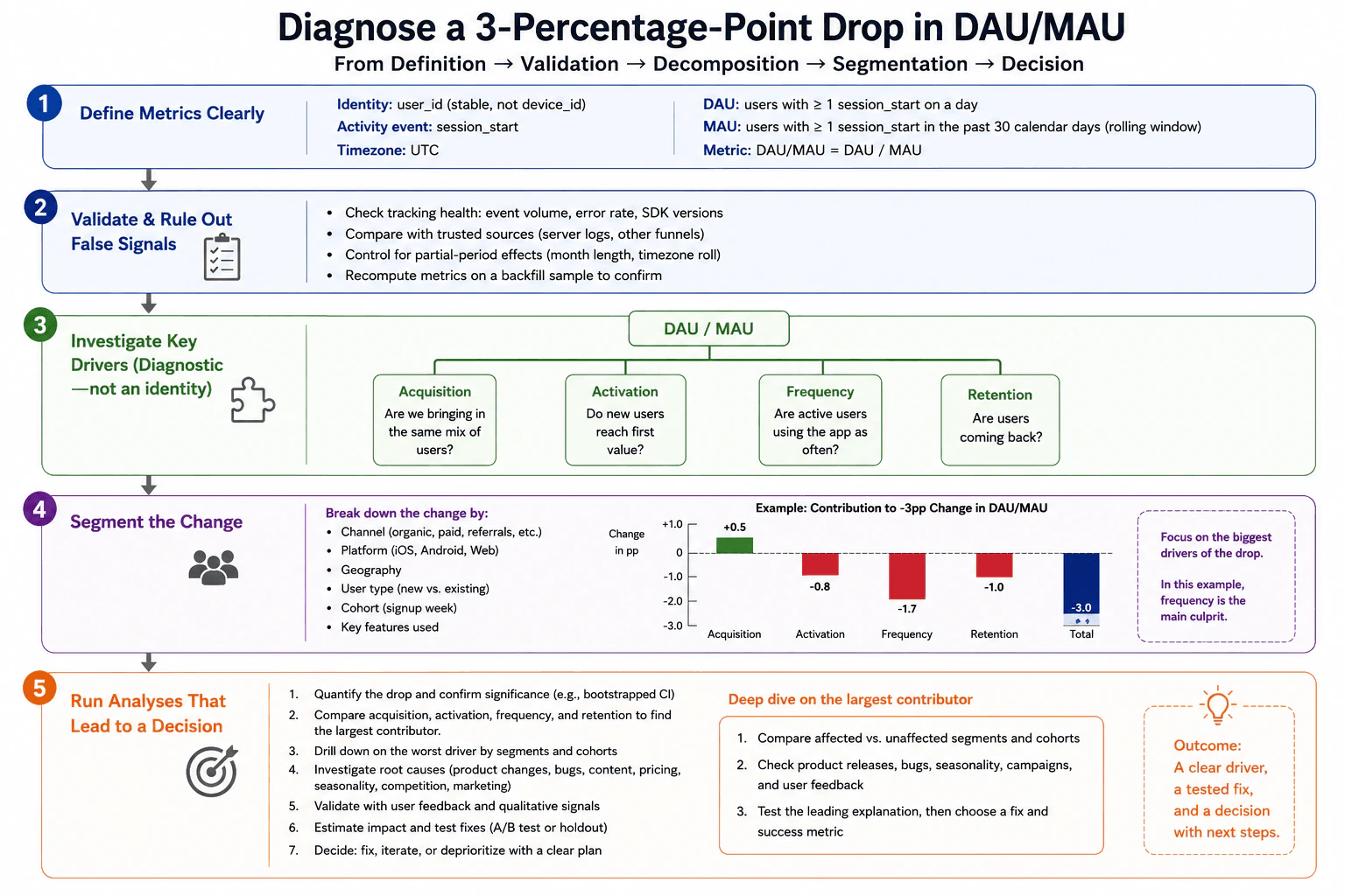
How would you diagnose a three-percentage-point drop in DAU divided by MAU? diagram
How to Explain It in an Interview

First, define the metric exactly. The identity is a stable user_id rather than device_id. The activity event is session_start. Use UTC consistently. DAU is the number of unique users with at least one session_start on a given day. MAU is the number of unique users with at least one session_start during the past 30 calendar days. The denominator is therefore MAU, and the diagnostic engagement metric is DAU/MAU = DAU divided by MAU. A three-percentage-point decline means the ratio fell by 0.03; it does not automatically mean a 3 percent relative decline.

Second, validate measurement before interpreting behavior. Check event volume, error rates, SDK versions, missing events, duplicate events, invalid user identifiers, identity-merging changes, filter changes, and pipeline freshness. Compare the metric with trusted sources such as server logs or another stable funnel when available. Recompute an earlier period with the current pipeline as a backfill check. Also check timezone boundaries, delayed data, incomplete periods, and any change in the rolling-window calculation. If the measurement contract changed, repair or restate the metric before doing product diagnosis.

Third, quantify and localize the decline. Compare like-for-like dates and estimate how large the movement is relative to normal variation. If uncertainty matters, use an appropriate interval or resampling method that respects the repeated-user structure. Then break the change down by acquisition channel, platform such as iOS, Android, or Web, geography, new versus existing users, signup cohort, and key features used. The goal is to find where the loss is concentrated, not to produce every possible slice.

Fourth, investigate four diagnostic drivers: acquisition, activation, frequency, and retention. These are diagnostic branches, not an exact algebraic factorization of DAU/MAU. For acquisition, ask whether the mix of users entering MAU changed. A large inflow of low-frequency users can grow MAU faster than DAU. For activation, ask whether new users still reach first value. For frequency, ask whether active users use the app on fewer days. For retention, ask whether users are returning at the same rate.

Rank the contributors and focus on the largest negative one. In the approved diagram, the contribution chart is an illustrative example: acquisition contributes +0.5 percentage points, activation -0.8, frequency -1.7, and retention -1.0, summing to the overall -3.0 percentage-point change. That example makes frequency the largest negative contributor. These values are teaching values only, not observed evidence from the real app.

Next, deep-dive on the largest contributor. Compare affected and unaffected segments and cohorts. If frequency is the largest contributor, compare active-day frequency or similar usage-frequency measures across cohorts and segments. Then check explanations that match the timing and affected population, such as product releases, bugs, content changes, pricing changes, seasonality, campaigns, competition, and user feedback.

Keep observed evidence separate from causal claims. A release occurring just before the decline is a correlation. It becomes a stronger causal explanation only if the affected population, exposure timing, mechanism, and additional evidence line up. When feasible, test the leading explanation with an A/B test or holdout. If an experiment is not feasible, use the strongest available comparison while being explicit about remaining uncertainty.

The practical sequence is: quantify the drop; validate the measurement; compare acquisition, activation, frequency, and retention; drill down on the largest contributor by segments and cohorts; investigate causes that match the timing; validate with qualitative evidence where useful; estimate the impact of a proposed fix; test it when feasible; then decide whether to fix, iterate, or deprioritize.

The product owner should receive a decision, not a hypothesis dump. I would state which driver and segment explain most of the observed movement, what evidence supports that conclusion, what uncertainty remains, what action should be taken or tested, and what success metric will show recovery. I would change the recommendation if the apparent driver turns out to be a measurement artifact, another segment explains more of the decline, or a controlled test fails to improve the target behavior.

Technical Approach
  1. Lock the metric contract: stable user_id, session_start, UTC, daily DAU, rolling 30-day MAU, and DAU/MAU.
  2. Validate event tracking, identity handling, filters, missingness, duplicates, data freshness, historical recomputation, timezone boundaries, and partial-period effects.
  3. Quantify the three-percentage-point movement over comparable dates and assess uncertainty when it could affect the decision.
  4. Segment the change by channel, platform, geography, new versus existing users, signup cohort, and key features used.
  5. Compare acquisition, activation, frequency, and retention as diagnostic drivers without treating them as an exact mathematical factorization.
  6. Rank the contributors and drill down on the largest negative contributor using affected versus unaffected segments and cohorts.
  7. Check product releases, bugs, content or pricing changes, seasonality, campaigns, competition, and user feedback that match the timing and population.
  8. Separate correlation from causation and test the leading explanation with an A/B test or holdout when feasible.
  9. Recommend a fix, iteration, or deprioritization decision with a success metric and monitoring plan.
Practical Insights

Computing DAU/MAU itself is simple, but the investigation can scan many user events across many days and segments. More segmentation can reveal a localized issue, but too many cuts can produce noisy patterns that look important by chance. Cohort and frequency analysis need stable user identity and enough history. Controlled experiments provide stronger causal evidence but require time and traffic. A good tradeoff is to start broad, identify the largest contributor, and spend deeper analysis only where it can change the product decision.

Why Interviewers Ask This

This question tests whether a Data Scientist can turn a headline engagement decline into a reliable product decision. The interviewer wants to see precise metric definitions, data-quality validation, structured diagnosis, useful segmentation, careful separation of correlation from causation, sensible treatment of uncertainty, and a clear recommendation instead of an unprioritized list of guesses.

Common interview mistakes

Common mistakes are using different identity rules, activity events, filters, timezones, or windows for DAU and MAU; ignoring incomplete or delayed data; overlooking tracking or identity changes; treating a three-percentage-point drop as the same as a 3 percent relative decline; treating acquisition, activation, frequency, and retention as an exact algebraic factorization of DAU/MAU; slicing the data into many segments without prioritizing the largest contributor; presenting illustrative contribution values as observed facts; confusing correlation with causation; and ending with guesses instead of a decision, test, and success metric.

Interview tip

Present the diagnosis as a path from confidence to action: define the metric, validate the data, localize the drop, compare the four diagnostic drivers, deep-dive on the largest contributor, test the leading explanation, and finish with the decision you would give the product owner.

Interviewer may ask next
What if MAU increased sharply while DAU stayed roughly flat?

DAU/MAU could fall even if the number of daily active users did not decline, because the denominator grew faster than the numerator. I would first verify that the MAU increase is real and uses the same rolling 30-day definition. Then I would segment the additional MAU by acquisition channel, platform, geography, and signup cohort. A large influx of users who are active only once or twice could lower the ratio through user-mix effects. I would therefore examine their activation, active-day frequency, and early retention before concluding that existing users became less engaged.

What if the largest observed drop starts immediately after a product release, but you cannot run an A/B test?

I would treat the timing as correlation, not proof of causation. I would compare affected and unaffected platforms, app versions, segments, and cohorts; verify exposure timing; inspect errors and user feedback; and check whether the release changed the user journey related to the declining driver. If several independent signals support the same mechanism and the downside is meaningful, the product owner could choose a reversible mitigation such as a rollback or targeted fix. I would then monitor DAU/MAU and the affected diagnostic metric. If they do not recover, I would revise the causal hypothesis.

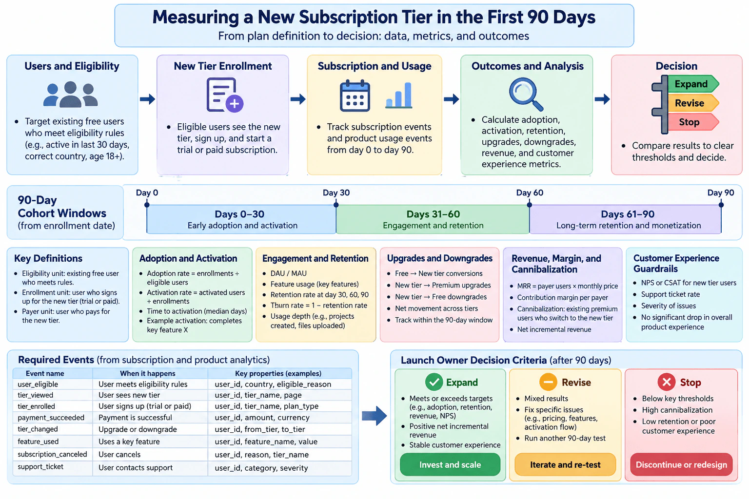
24. How would you measure a new subscription tier during its first 90 days?Data Analysis And Product SenseEasy

Question Details

A digital product adds a tier between free and premium. Define eligibility, enrollment and payer units, the 90-day cohort windows, adoption and activation metrics, engagement and retention outcomes, upgrades and downgrades across existing tiers, revenue and margin cannibalization, and customer-experience guardrails. Specify the required subscription and usage events and the launch owner's decision criteria for expand, revise, or stop.

Short Interview Answer (30-60 seconds)

I would follow eligible users from enrollment for 90 days and measure adoption, activation, engagement, retention, tier movement, revenue, margin, cannibalization, and customer experience. I would validate the required events first, then let the launch owner expand, revise, or stop based on predefined targets and guardrails.

Detailed Explanation

The goal is to decide whether the new tier creates enough user and business value to expand after its first 90 days. I would first define who is eligible, what counts as enrollment, and what counts as a payer. Then I would follow each user from the enrollment date through days 0–30, 31–60, and 61–90. I would measure adoption, activation, engagement, retention, tier movement, revenue, margin, cannibalization, and customer experience. Before making a decision, I would verify that the subscription and usage events are complete, valid, and consistently defined.

Useful Questions to Ask the Interviewer
  1. What exact rules make a user eligible to see and join the new tier?
  2. Does enrollment mean starting the tier, or only completing a successful payment?
  3. What product behavior should count as activation for this tier?
  4. Which financial outcome matters most for the launch decision: revenue, contribution margin, or both?
  5. Are there already agreed targets or guardrails for adoption, retention, cannibalization, and customer experience?
How would you measure a new subscription tier during its first 90 days? diagram
How to Explain It in an Interview

I would organize the measurement plan from population definition to the final launch decision.

First, define the population and units. The eligible population is the set of users allowed to see and enroll in the new tier. The diagram gives examples such as recent activity, an allowed country, and age eligibility, so I would treat those as illustrative eligibility rules unless the product team confirms them. An enrollment unit is a user who starts the new tier, whether trial or paid according to the product definition. A payer unit is a user with a successful payment. These units must stay separate because enrollment and payment answer different questions.

Second, define cohort entry and time windows. Each user's 90-day observation window begins on that user's enrollment date. I would follow the same cohort across days 0–30, 31–60, and 61–90. The first period is most useful for early adoption and activation, the second for engagement and retention, and the final period for longer-term retention and monetization. For each metric, the denominator must remain tied to its intended population instead of silently excluding users who later become inactive, downgrade, or cancel.

Third, measure adoption and activation. Adoption rate is enrolled users divided by eligible users. Activation rate is activated users divided by enrolled users, where activation must be a predefined meaningful behavior such as completing the tier's key feature. I would also track time to activation because a tier can attract signups but still make it difficult for users to reach value.

Fourth, measure engagement and retention. Engagement can include DAU/MAU, key-feature usage, and usage depth when those measures are meaningful for this product. Retention should be measured at consistent checkpoints such as days 30, 60, and 90. A retention metric should use a clearly defined active or retained state and an eligible cohort denominator. Churn is a related loss measure and must use a compatible population and time definition. I would not treat high activity as success by itself unless it connects to continued subscription value.

Fifth, measure movement between tiers. Track free-to-new-tier conversions, new-tier-to-premium upgrades, new-tier-to-free downgrades, cancellations, and net movement. This shows whether the new middle tier attracts incremental demand or mainly shifts existing users between plans.

Sixth, measure economics. Track subscription revenue, contribution margin per payer, net incremental revenue, and cannibalization. For a simple single-price monthly plan, a teaching-level MRR calculation can be payer users multiplied by monthly price. In production, I would use the business's existing billing definition. Cannibalization means existing premium users moving to the cheaper new tier, which can reduce revenue or margin that the product might otherwise have retained.

Seventh, protect customer experience. Guardrails include NPS or CSAT for new-tier users, support-ticket rate, issue severity, and evidence of a meaningful decline in overall product experience. A tier should not be expanded just because adoption or revenue looks good if it creates unacceptable customer harm or operational burden.

Eighth, define the instrumentation contract. The required subscription and usage events in the diagram are user_eligible, tier_viewed, tier_enrolled, payment_succeeded, tier_changed, feature_used, subscription_canceled, and support_ticket. Important properties include user_id plus the relevant eligibility reason, tier name, plan type, payment amount and currency, from-tier and to-tier values, feature name, cancellation reason, support category, and severity. Event timestamps are also required to construct the 90-day windows and establish event ordering.

Before interpreting movement, I would validate instrumentation and data quality. I would check duplicates, missing user identifiers, invalid tier transitions, missing payment records, unexpected event ordering, and inconsistent event definitions. I would also check cohort maturity. For example, a user enrolled only 20 days ago cannot yet contribute valid day-30, day-60, or day-90 retention evidence. Data freshness matters because late-arriving events can make recent cohorts look artificially weak.

I would keep observed evidence separate from assumptions. Seasonality, other product changes, pricing changes, marketing changes, or shifts in the mix of eligible users could confound the results. A 90-day cohort analysis describes what happened, but it does not by itself prove that the new tier caused the change. If causal attribution is important, I would ask whether there is a valid control group or experiment.

Finally, the launch owner compares the scorecard with predefined targets and guardrails. Expand when the important adoption, retention, economics, and customer-experience measures meet or exceed the required thresholds, net incremental value is positive, and customer experience remains stable. Revise when results are mixed but specific problems such as pricing, features, targeting, or activation flow appear fixable, then run another test. Stop or redesign when key thresholds are missed, cannibalization is too high, retention is weak, economics are poor, or customer experience is unacceptable. I would not invent a single north-star metric if the business has not defined one; for this question, the decision should use the balanced evidence requested in the launch scorecard.

Technical Approach
  1. Define eligibility rules and keep eligible users as the adoption denominator.
  2. Define enrollment and payer units separately.
  3. Start each user's 90-day cohort window on the enrollment date.
  4. Validate the required subscription and usage events before calculating metrics.
  5. Measure adoption and activation in the early window.
  6. Measure engagement and retention at consistent 30-, 60-, and 90-day checkpoints using only cohorts mature enough to reach each checkpoint.
  7. Measure free-to-new, new-to-premium, new-to-free, cancellation, and net tier movement.
  8. Measure revenue, contribution margin, net incremental revenue, and premium cannibalization.
  9. Monitor customer-experience guardrails such as satisfaction, support-ticket rate, and issue severity.
  10. Check duplicate, missing, invalid, late, and out-of-order event data.
  11. Check relevant confounders and keep descriptive evidence separate from causal claims.
  12. Compare the complete scorecard with predefined targets and choose expand, revise and re-test, or stop and redesign.
Practical Insights

The calculations are mostly simple counts, ratios, and cohort summaries. The harder part is keeping definitions and denominators correct. Different denominators can make adoption or retention look better than it really is. A complete 90-day read also takes time because newer cohorts have not matured yet. More event tracking improves diagnosis but adds instrumentation, data-quality, storage, and maintenance work. A strict threshold framework makes decisions more consistent, but the launch owner still has to balance user value, financial value, cannibalization, uncertainty, and customer guardrails.

Why Interviewers Ask This

This question tests whether a Data Scientist can turn a product launch into a measurable decision. The interviewer wants to see correct populations and denominators, cohort thinking, event instrumentation, product and financial metrics, customer guardrails, tier-movement analysis, data-quality judgment, and a clear framework for deciding whether to expand, revise, or stop the launch.

Common interview mistakes

Common mistakes are using enrollments as the denominator for adoption instead of eligible users; mixing enrolled users with successful payers; starting all users on one calendar date instead of each user's enrollment date; measuring 60- or 90-day retention for cohorts that have not reached those ages; dropping canceled users and creating survivorship bias; looking only at signups while ignoring activation and retention; counting revenue without margin or premium cannibalization; ignoring upgrades and downgrades across existing tiers; treating usage as proof of value without customer-experience guardrails; interpreting metrics before validating events; ignoring late or duplicate events; and claiming the launch caused changes when the analysis is only observational.

Interview tip

Present the answer as one flow: define the population and units, define the 90-day cohort, validate events, measure user and financial outcomes, check guardrails, then make the expand-revise-stop decision. State each important numerator and denominator so the interviewer can see that the metrics are well defined.

Interviewer may ask next
How would you handle users who enroll late in the launch period and have not yet reached the 60- or 90-day retention checkpoints?

I would use only mature cohorts for each checkpoint. A user must have had enough observation time before contributing to that retention measure. For example, a user must have at least 30 days of follow-up before entering the day-30 retention denominator and at least 90 days before entering the day-90 retention denominator. I would still report adoption, activation, and any earlier mature metrics for newer cohorts, but I would label later retention results as incomplete. This avoids denominator errors and prevents immature cohorts from making retention look artificially strong or weak.

What would you do if adoption and customer satisfaction are strong, but many premium users downgrade to the new tier and contribution margin falls?

I would not expand immediately. Strong adoption and satisfaction show that users like the tier, but heavy premium downgrades and weaker contribution margin mean the business may be transferring existing value rather than creating enough incremental value. I would classify the result as revise, identify where the cannibalization comes from, and test changes such as pricing, feature boundaries, targeting, or eligibility. I would expand only if the revised tier keeps the user benefit while bringing cannibalization and margin within the launch owner's accepted thresholds.

25. How would you evaluate an optional add-ons control in checkout?Data Analysis And Product SenseEasy

Question Details

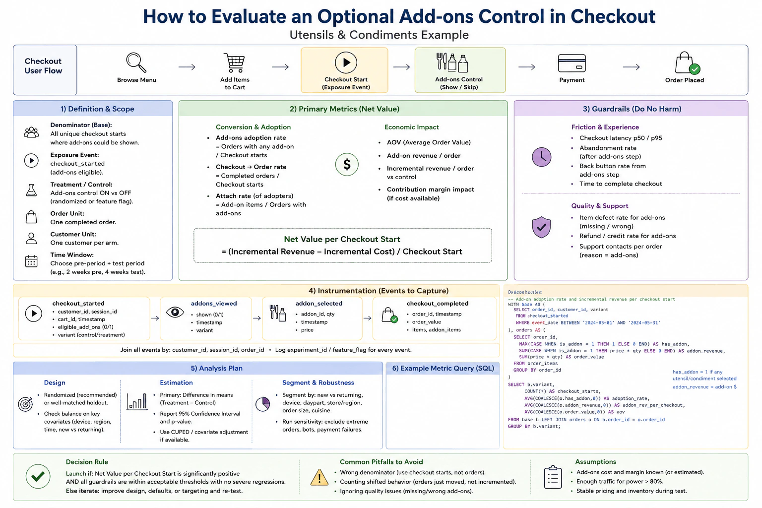
An order checkout adds a control for utensils and condiments; it may increase basket value but also add friction and fulfillment mistakes. Define the checkout-start denominator, exposure event, order and customer units, time window, conversion and incremental value metrics, latency and abandonment guardrails, item-defect and support outcomes, and instrumentation needed to tell a net-positive launch from shifted or miscounted behavior.

Short Interview Answer (30-60 seconds)

I would compare treatment and control from the same eligible checkout-start denominator. I would measure checkout conversion, add-on adoption, incremental revenue or contribution value, latency, abandonment, fulfillment defects, refunds or credits, and support contacts. I would validate exposure logging and joins first, then launch only when value is credibly positive and guardrails remain acceptable.

Detailed Explanation

The goal is to decide whether the optional utensils and condiments control is net positive. It may increase basket value, but it can also slow checkout, increase abandonment, or create fulfillment mistakes. I would begin with all unique checkout starts where the control could have been shown, then compare treatment with control on that same eligible population. The main decision should combine incremental value with customer-experience and fulfillment guardrails. Before reading the result, I would verify exposure logging, experiment assignment, timestamps, order joins, duplicate events, and missing identifiers so shifted or miscounted behavior does not look like a win.

Useful Questions to Ask the Interviewer
  1. Is the add-ons control available to every checkout, or only to certain eligible carts, stores, or order types?
  2. Is treatment assignment randomized, and how is assignment kept consistent during the experiment?
  3. Do we know the cost or contribution margin of the utensils and condiments, or should revenue be the economic measure?
  4. How quickly do fulfillment defects, refunds or credits, and support contacts become available after an order?
  5. What latency, abandonment, defect, or support changes would be unacceptable for launch?
How would you evaluate an optional add-ons control in checkout? diagram
How to Explain It in an Interview

First, define the denominator correctly. I would use unique checkout starts where the add-ons control was eligible to appear. This is important because an order-only denominator would remove people who abandoned checkout and could make the feature look better than it really is.

Next, define exposure separately from eligibility. Log checkout_started for the eligible checkout and addons_viewed when the add-ons control is actually rendered. Treatment or control assignment should also be attached to the events. This lets us distinguish a user who was assigned to treatment from a user who truly saw the control.

Keep the units clear. The checkout or session unit is useful for checkout conversion, latency, and abandonment. The order unit is one completed order and is used for revenue, add-on items, defects, refunds or credits, and order-level support outcomes. The customer unit is one customer per experiment arm and is useful for repeated behavior and checking whether customers appear in both arms. Raw event rows are instrumentation records and should not be treated as independent customers or orders.

Choose the analysis window before looking at the result. A reasonable design can include a pre-period for balance or covariate checks and a test period long enough to cover normal day-of-week patterns. The diagram illustrates two weeks of pre-period and four weeks of testing as an example, not as a universal requirement. Use one consistent business timezone for event ordering and window boundaries because the question does not specify a timezone.

For the primary decision metric, I would focus on net value per eligible checkout start. A simple form is (incremental revenue - incremental cost) / eligible checkout starts. This keeps the economic result tied to the full checkout population. If reliable cost information is not available, I would report incremental revenue per checkout start and clearly state that contribution margin is not fully measured.

Then measure conversion and adoption. Add-on adoption rate is orders with at least one add-on divided by eligible checkout starts. Checkout-to-order conversion is completed orders divided by eligible checkout starts. Among orders that contain add-ons, attach rate can be measured as the number of add-on items divided by orders with add-ons. Average order value and add-on revenue per order help explain where the economic change comes from.

The causal comparison should be treatment minus control. For example, incremental revenue per order is the treatment value minus the control value. However, I would not rely only on revenue per completed order because a higher basket value can hide lost conversions. The final economic decision should therefore be expressed per eligible checkout start. I would report confidence intervals around the treatment-control differences and make a causal claim only when the experiment or holdout design supports it.

Latency and abandonment are key experience guardrails. Measure checkout latency at p50 and p95, abandonment after the add-ons step, back-button behavior from that step, and time to complete checkout. A revenue increase is not a clean win if the control meaningfully slows checkout or causes more customers to leave.

Fulfillment quality is another guardrail. Track missing or wrong add-on items, refunds or credits related to add-ons, and support contacts per order with an add-on-related reason. These outcomes catch a failure mode where the interface increases selections but creates extra work or mistakes during fulfillment.

Instrumentation should cover the complete funnel: checkout_started -> addons_viewed -> addon_selected -> checkout_completed. Important properties include customer ID, session ID, order ID when available, timestamp, experiment or feature-flag assignment, add-on ID, quantity or price where relevant, order value, and selected add-on items. Join events using the appropriate customer, session, and order identifiers. Check event uniqueness, missing IDs, duplicate events, timestamp ordering, assignment consistency, and treatment-control logging completeness before interpreting movement.

For estimation, a randomized experiment is preferred. A well-matched holdout can be used when randomization is not available, but causal confidence is weaker. Report treatment-minus-control differences with confidence intervals. If useful and available, pre-period covariates can support balance checks or methods such as CUPED to reduce variance without changing the experiment's causal target.

I would also inspect supported segments such as new versus returning customers, device, daypart, store or region, and order-size band when those dimensions are reliably available. Segment analysis is diagnostic. I would not declare a small subgroup successful just because it has a large but noisy estimate.

Run sensitivity checks for clearly defined extreme orders, bots, payment failures, and invalid traffic. These exclusion rules should be defined without using the treatment outcome. Also check whether pricing, inventory, day-of-week patterns, or operational changes could explain apparent movement during the test.

The launch rule is simple. Launch when net value per eligible checkout start is credibly positive and checkout conversion, latency, abandonment, fulfillment defects, refunds or credits, and support guardrails remain within acceptable limits with no severe regression. If value appears positive but a guardrail materially worsens, iterate or hold. If the gain disappears after correcting the denominator, exposure logging, duplicate events, or joins, do not launch. The same applies when orders or revenue are merely shifted between paths instead of creating incremental value.

Technical Approach
  1. Define the eligible cohort as unique checkout starts where the add-ons control could be shown.
  2. Assign eligible traffic consistently to treatment and control using the experiment or holdout design.
  3. Log checkout_started, actual addons_viewed exposure, add-on selections, and completed orders with consistent experiment identifiers.
  4. Validate timestamps, missing identifiers, duplicate events, experiment assignment, event ordering, and joins before calculating metrics.
  5. Measure checkout conversion and add-on adoption using eligible checkout starts as the base denominator.
  6. Measure average order value, add-on revenue, and incremental revenue or contribution value versus control.
  7. Express the main economic result per eligible checkout start so larger completed baskets cannot hide lost conversions.
  8. Measure p50 and p95 latency, post-add-ons abandonment, back-button behavior, and checkout completion time as experience guardrails.
  9. Measure missing or wrong add-ons, refunds or credits, and add-on-related support contacts as quality outcomes.
  10. Estimate treatment-minus-control effects with confidence intervals using the chosen experiment or holdout design.
  11. Review supported segments and sensitivity checks without changing the primary success rule after seeing the data.
  12. Launch only when incremental net value is credible and the experience, fulfillment, and support guardrails remain acceptable.
Practical Insights

The arithmetic is simple, but data correctness is difficult. Checkout events, orders, customers, and support records have different grains, so careless joins can double count results. Fulfillment defects and support contacts may arrive later than checkout events, so the final analysis may need to wait for those outcomes. Looking at many segments also increases the chance of finding noisy differences by chance. A randomized experiment gives stronger causal evidence, while a matched holdout has more possible confounding. If cost data is missing, revenue is easier to measure but gives a less complete picture of true business value.

Why Interviewers Ask This

This question tests whether a Data Scientist can turn a checkout product change into a trustworthy measurement plan. The interviewer wants to see a correct denominator, clear exposure and analysis units, useful business and customer metrics, reliable instrumentation, causal reasoning, protection against harmful side effects, and a launch decision that considers both incremental value and operational risk.

Common interview mistakes

Common mistakes include using completed orders instead of eligible checkout starts as the main denominator, treating experiment assignment as proof that the control was actually shown, counting duplicate events as separate users or orders, and measuring only average order value while ignoring conversion loss. Other mistakes are calling add-on revenue incremental without a control comparison, ignoring latency and abandonment, failing to measure missing or wrong items and support contacts, joining events to the wrong order, changing exclusion rules after seeing results, over-interpreting noisy segments, and launching from a positive point estimate without checking uncertainty and guardrails.

Interview tip

Lead with the denominator and the launch rule. Explain that the feature must create incremental value per eligible checkout start, not merely larger completed baskets. Then cover actual exposure, conversion and value metrics, latency and abandonment guardrails, fulfillment quality, instrumentation checks, and the evidence that would make you launch, iterate, or stop.

Interviewer may ask next
What would you do if many treatment users are assigned to the add-ons feature but the addons_viewed event is missing?

I would not immediately restrict the primary analysis to users with addons_viewed, because that can introduce selection bias when rendering or logging failure depends on user behavior. I would keep experiment assignment as the basis for the primary intention-to-treat comparison and investigate why assigned treatment checkouts lack the exposure event. I would compare missing-exposure rates across supported dimensions, verify whether the control failed to render or only failed to log, and inspect event ordering and identifiers. I would not call the feature net positive until I understood whether the missing exposure data could change the denominator, conversion result, or economic estimate.

What if the add-ons control increases revenue per completed order but also increases checkout abandonment?

I would put both effects on the same eligible checkout-start denominator. Higher revenue per completed order can be misleading when fewer checkout starts become completed orders. I would calculate incremental revenue or contribution value per eligible checkout start and compare the abandonment increase with the predefined guardrail and its uncertainty. If net value per checkout start is not credibly positive, or abandonment materially breaches the acceptable guardrail, I would hold or iterate rather than launch. The goal is incremental value without unacceptable checkout friction.

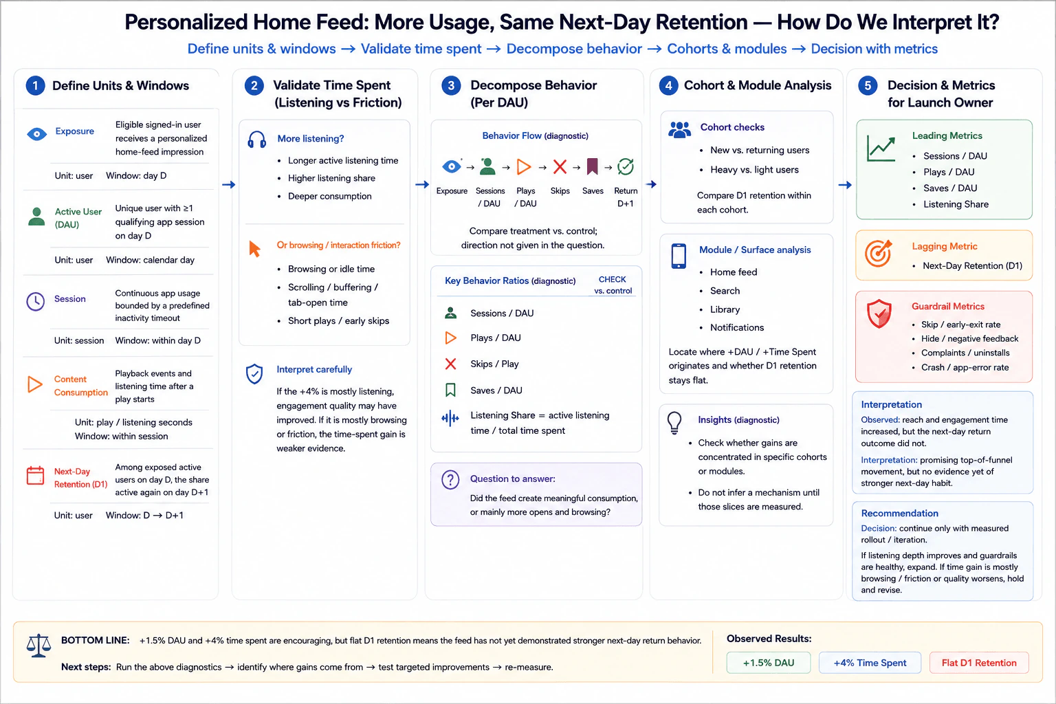
26. A personalized home feed raises daily users and time spent but not next-day retention. How do you interpret it?Data Analysis And Product SenseMedium

Question Details

A redesigned personalized feed produces +1.5% daily active users and +4% time spent while next-day retention is flat. Define exposure, active-user, session, content-consumption, and retention units and windows; check whether time spent reflects listening or browsing friction; decompose sessions, plays, skips, saves, and return behavior; inspect cohort and module effects; and give the launch owner a decision with leading, lagging, and guardrail metrics.

Short Interview Answer (30-60 seconds)

I would treat +1.5% DAU and +4% time spent as encouraging, but flat D1 retention means stronger next-day habit is not demonstrated. I would verify measurement, separate listening from browsing time, decompose behavior by cohorts and modules, and expand only if quality improves without guardrail harm.

Detailed Explanation

The observed result is mixed: the personalized feed increases DAU by 1.5% and time spent by 4%, but next-day retention is flat. More people are active and they spend longer in the product, yet there is no evidence that the experience makes them more likely to return the next day. I would not call the redesign a success or failure from these three numbers alone. I would first lock the measurement definitions, validate instrumentation, understand what created the extra time, decompose downstream behavior, and then make a rollout decision using leading, lagging, and guardrail metrics.

Useful Questions to Ask the Interviewer
  1. Are the +1.5% DAU and +4% time-spent values treatment-versus-control deltas, and is D1 retention measured on the same exposed population?
  2. What event counts as exposure: eligibility, rendering, or an actual personalized home-feed impression?
  3. What qualifies a user as active, and what calendar-day boundary and time zone are used for DAU and D1 retention?
  4. What inactivity timeout defines a new session?
  5. Does total time spent distinguish active listening from browsing, idle, buffering, or background time?
  6. Which affected surfaces should we inspect, such as the home feed, search, library, and notifications?
A personalized home feed raises daily users and time spent but not next-day retention. How do you interpret it? diagram
How to Explain It in an Interview
1. Start with the observed evidence

The only observed movements I should claim are +1.5% DAU, +4% time spent, and flat D1 retention. These show that reach and engagement time increased while the next-day return outcome did not. They do not tell us why.

I would not claim that the feed caused more skipping, fewer saves, shallower consumption, or weaker habit. Those are diagnostic hypotheses to test.

2. Define the measurement contract

Exposure means an eligible signed-in user receives a personalized home-feed impression. The unit is the user and the window is day D.

An active user, or DAU, is a unique user with at least one qualifying app session on day D. The unit is the user and the window is a calendar day. I would use one agreed time zone consistently across treatment and control.

A session is continuous app usage bounded by a predefined inactivity timeout. The unit is the session and the window is within day D. I would use the product's established timeout rather than inventing one.

Content consumption means playback events and listening time after a play starts. Useful units are play events and listening seconds within a session.

D1 retention is the share of exposed active users on day D who are active again on day D+1. The numerator is exposed active users from day D who return on D+1. The denominator is all exposed active users in the day-D cohort. The cohort-entry rule and day boundary must remain fixed.

3. Validate instrumentation before interpreting movement

I would verify that exposure, session, play, skip, save, listening-time, and return events are logged consistently. I would check duplicate events, missing events, identity changes, delayed events, client-version differences, and whether treatment and control use the same definitions and windows.

If this result comes from an experiment, I would also verify treatment assignment and exposure logging. If it is observational, I would be more cautious about causal language because population differences or other changes could explain the movement.

4. Determine whether the +4% time spent represents value

Time spent is a proxy, so I need to know what the additional time contains.

One positive hypothesis is that users are doing more active listening, have a higher listening share, or consume content more deeply. A weaker hypothesis is that users spend more time browsing, scrolling, idle, buffering, keeping the tab open, or starting short plays that they quickly abandon.

A useful diagnostic is listening share = active listening time / total time spent. If most of the +4% comes from active listening, the engagement-quality interpretation becomes stronger. If most of it comes from browsing or friction, the time-spent increase is weaker evidence of user value.

5. Decompose the behavior path

I would compare treatment and control across the diagnostic sequence: exposure → sessions per DAU → plays per DAU → skips → saves → return on D+1.

Sessions per DAU tells me whether users enter or re-enter more often. Plays per DAU tells me whether additional activity converts into consumption. Skips per play helps diagnose poorly matched or unwanted content. Saves per DAU can indicate stronger intent or affinity. Listening share separates active consumption from non-listening time.

The question does not provide the direction of these metrics, so I would measure them rather than assume their outcomes.

6. Inspect cohort effects

The aggregate flat D1 result could hide different effects across groups. I would compare new versus returning users and heavy versus light users, matching the diagram's cohort checks.

For each cohort, I would calculate D1 retention using that cohort's own eligible denominator. I would not condition the denominator on later actions such as completing a play or saving content, because doing so would introduce survivorship bias.

If one cohort improves while another declines, I would not hide that difference inside the aggregate result. It could materially change the rollout decision.

7. Inspect module and surface effects

I would locate where the DAU and time-spent gains originate across the home feed, search, library, and notifications.

The goal is to determine whether the gains are concentrated in a particular surface and whether the flat D1 result is also concentrated there. I would treat these module-level patterns as diagnostics unless the experimental design supports a causal interpretation.

8. Use a clear metric hierarchy

The lagging metric is next-day retention, because the unresolved product question is whether the redesigned feed produces stronger next-day return behavior.

The leading metrics are sessions per DAU, plays per DAU, saves per DAU, and listening share. They help explain whether the engagement increase reflects meaningful consumption.

The guardrail metrics are skip or early-exit rate, hide or negative-feedback rate, complaints or uninstalls, and crash or app-error rate. These prevent us from declaring success based only on higher usage when user experience or product quality is getting worse.

9. Make an evidence-proportional decision

My recommendation is to continue only with a measured rollout or iteration rather than immediately expanding to a full launch. The current result is promising at the top of the funnel, but it has not demonstrated stronger next-day return behavior.

If listening depth and the leading quality signals improve while guardrails remain healthy, I would support expanding the rollout. If the time-spent gain is mostly browsing or friction, or if skips, negative feedback, complaints, uninstalls, or app errors worsen, I would hold expansion and revise the experience.

The main tradeoff is that waiting only for D1 retention can ignore useful early engagement signals, while optimizing only DAU or time spent can reward superficial activity. The launch owner should use leading diagnostics to explain behavior, D1 retention as the lagging outcome, and guardrails to protect user experience.

10. Bottom line

The right interpretation is not simply 'engagement improved' or 'the redesign failed.' The evidence says +1.5% DAU and +4% time spent are encouraging, but flat D1 retention means the feed has not yet demonstrated stronger next-day return behavior. Run the diagnostics, identify where the gains originate, test targeted improvements, and re-measure before making a stronger product claim.

Technical Approach
  1. Lock the definitions for exposure, active user, session, content consumption, D1 retention, cohort entry, day boundary, and time zone.
  2. Validate treatment assignment if applicable and verify exposure, session, play, skip, save, listening-time, and return instrumentation.
  3. Confirm the three supplied observations: +1.5% DAU, +4% time spent, and flat D1 retention.
  4. Separate active listening time from browsing, idle, buffering, and other non-listening time.
  5. Compare sessions per DAU, plays per DAU, skips per play, saves per DAU, and listening share between treatment and control.
  6. Compare D1 retention within new versus returning and heavy versus light cohorts.
  7. Inspect home-feed, search, library, and notification surfaces to locate where the gains originate.
  8. Review guardrails including early exits, negative feedback, complaints or uninstalls, and app errors.
  9. Expand only if engagement quality improves and guardrails remain healthy; otherwise hold and iterate.
  10. Re-measure D1 retention after targeted changes.
Practical Insights

The main cost is analytical rather than computational. More cohort and module cuts create more comparisons, so noisy data can produce misleading stories if sample sizes are small. Event-level analysis also depends on reliable user identity, timestamps, exposure logs, session boundaries, and playback events. Retention is lagging because the return window must pass before the outcome is complete. A measured rollout is slower than an immediate full launch, but it reduces the risk of optimizing a proxy such as time spent while harming quality. The analysis should therefore use the smallest set of cohort and surface cuts needed to explain the mixed result.

Why Interviewers Ask This

This question tests whether a Data Scientist can avoid treating higher activity as automatic product success. The interviewer wants precise metric definitions, correct user and session grain, cohort reasoning, diagnostic decomposition, separation of observed evidence from hypotheses, and a launch recommendation proportional to uncertainty. It also tests whether the candidate can connect proxy engagement metrics such as time spent to a meaningful outcome such as next-day return behavior while protecting user experience with guardrail metrics.

Common interview mistakes

Common mistakes are declaring success because DAU and time spent increased; declaring failure only because D1 retention is flat; inventing explanations such as higher skipping without measuring them; leaving exposure, active-user, session, and retention definitions ambiguous; mixing user, session, and event denominators; measuring retention on a different population from the exposed day-D cohort; ignoring time-zone and day boundaries; treating browsing time as equivalent to active listening; conditioning cohorts on downstream survivors; adding unsupported segments; confusing correlation with causation; and recommending a full launch without checking quality and guardrail metrics.

Interview tip

Start with the three observed facts, then say that the key question is what created the extra time. Define the measurement contract, walk through exposure → sessions → plays → skips → saves → D1 return, inspect cohorts and modules, and finish with a conditional launch decision. Label every unobserved explanation as a hypothesis rather than a result.

Interviewer may ask next
What if D1 retention is still flat overall, but it improves for new users and declines for returning users?

I would not average those effects away. I would first verify that both cohorts use stable definitions, the same D1 window, and enough data for a reliable comparison. Then I would examine the treatment effect and the same behavior diagnostics separately for new and returning users. An improvement for new users could mean the personalized feed helps discovery, while a decline for returning users could indicate that it disrupts established behavior. I would avoid a universal expansion until I understood the tradeoff. If supported by the experimental design, I could test a targeted experience by cohort while measuring D1 retention and the same guardrails separately.

What if the +4% time-spent increase is almost entirely active listening, guardrails are healthy, but D1 retention remains flat?

That would strengthen the case that the redesign improves in-session value because the additional time reflects actual consumption rather than browsing friction. I would still not claim stronger habit because D1 retention remains unchanged. I would continue a measured rollout, check whether plays per DAU, saves per DAU, and other quality signals move consistently, and keep measuring D1 retention with sufficient sample size. If active listening remains higher with healthy guardrails but D1 stays flat, I would describe the result as better in-session engagement without evidence of stronger next-day return behavior and decide whether that in-session benefit is sufficient for the product goal.

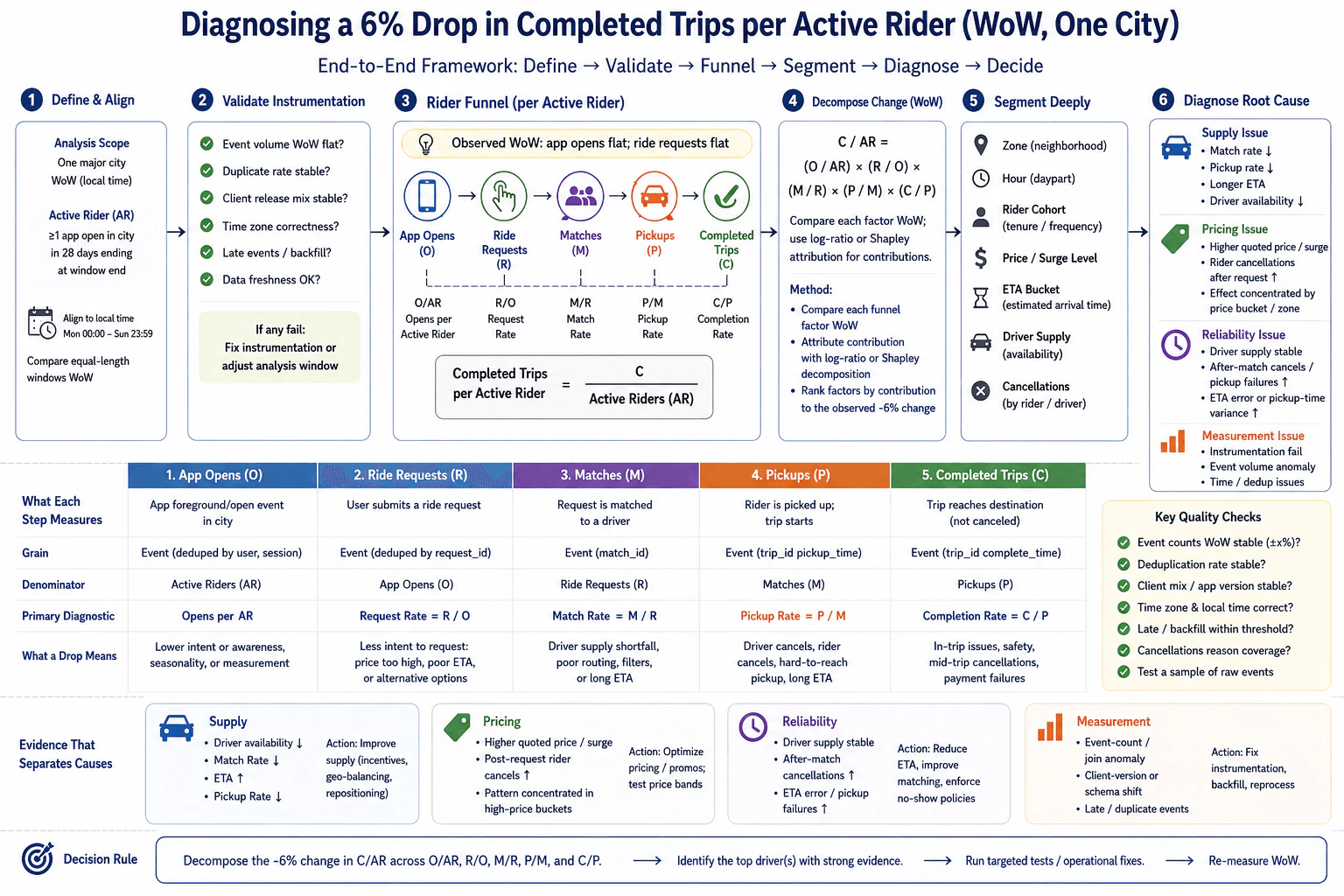
27. Completed trips per active rider fell 6% while app opens and ride requests stayed flat. How would you diagnose it?Data Analysis And Product SenseMedium

Question Details

The decline occurs week over week in one major city. Define active rider, request, match, pickup, and completed-trip events and denominators, align local-time windows, validate instrumentation, decompose each funnel transition, and segment by zone, hour, rider cohort, price, estimated arrival time, driver supply, and cancellations. State what evidence would separate supply, pricing, reliability, and measurement causes for the marketplace operator.

Short Interview Answer (30-60 seconds)

I would first validate the metric, active-rider denominator, local-time windows, and instrumentation. Then I would decompose completed trips per active rider into opens per active rider and each funnel conversion. Since opens and requests are flat, I would locate later-funnel leakage, segment it, and use supply, pricing, reliability, and measurement evidence to choose the next action.

Detailed Explanation

The goal is to explain a 6% week-over-week decline in completed trips per active rider in one major city without jumping to a cause. I would first define the population and events exactly as in the analysis, align equal-length local-time windows, and validate the data. Then I would decompose the journey from app open to request, match, pickup, and completed trip. Because aggregate app opens and ride requests are observed to be flat, I would pay special attention to the active-rider denominator and later funnel conversions. Finally, I would segment the change and compare evidence for supply, pricing, reliability, and measurement causes before the marketplace operator acts.

Useful Questions to Ask the Interviewer
  1. Is an active rider defined as a rider with at least one app open in the city during the 28 days ending at each analysis-window end, as shown in the approved definition?
  2. Are the two week-over-week windows equal-length local-city windows with the same day-of-week boundaries?
  3. Were there any client releases, event-schema changes, backfills, delayed events, or known logging incidents during either week?
  4. Do request, match, pickup, completion, and cancellation records have identifiers that allow reliable deduplication and joins?
  5. Are zone, local hour, rider cohort, quoted price or surge, ETA, driver availability, and rider or driver cancellation reason available at the relevant event or trip grain?
Completed trips per active rider fell 6% while app opens and ride requests stayed flat. How would you diagnose it? diagram
How to Explain It in an Interview

I would begin with the decision owner and business goal. The marketplace operator needs to know whether the 6% decline reflects a real supply, pricing, or reliability problem, or a measurement problem, so it can choose a targeted response instead of changing the marketplace broadly.

First, define the eligible population and metric. An active rider, AR, is a rider with at least one app open in the city during the 28 days ending at the analysis-window end. That rule must be applied identically to both weeks. Completed trips per active rider is C/AR, where C is the number of completed trips in the analysis week and AR is the eligible active-rider denominator for that window. A completed trip is a trip that reaches its destination and is not canceled. Using all eligible active riders in the denominator avoids restricting the metric only to riders who requested or completed a trip.

Next, define the funnel events and their grains. O is app opens, measured as foreground or open events associated with riders or sessions. R is a submitted ride request at request grain. M is a request successfully matched to a driver at match grain. P is a successful rider pickup where the rider is picked up and the trip starts, at trip grain. C is a completed trip at trip grain. Deduplicate using the appropriate identifiers before calculating rates, such as rider or session identifiers for opens, request identifiers for requests, match identifiers for matches, and trip identifiers for pickups and completions.

Use equal-length week-over-week windows in the city's local time, for example the same Monday-through-Sunday boundaries. This prevents UTC versus local-time shifts or unequal windows from looking like a marketplace change. Keep the 28-day active-rider lookback anchored consistently to each week's window end.

Before interpreting the decline, validate instrumentation. Check event-volume sanity, duplicate rates, client or app-version mix, timestamp and local-time correctness, late events or backfills, data freshness, cancellation-reason coverage, and request-to-match-to-pickup-to-completion joins. Inspect raw-event samples as a final sanity check. If these quality checks fail, repair or reprocess the data before drawing a marketplace conclusion.

The north-star metric is completed trips per active rider, C/AR. App opens and ride requests are observed input signals. The main diagnostic metrics are opens per active rider, request rate, match rate, pickup rate, and completion rate. Data-quality metrics include duplicate rate, event-volume consistency, join integrity, client-version stability, timestamp correctness, freshness, and late-event behavior. Rider and driver cancellations and service-reliability measures should also be watched as guardrails when testing an operational change so that improving one funnel rate does not simply shift harm elsewhere.

The funnel identity is: C / AR = (O / AR) × (R / O) × (M / R) × (P / M) × (C / P)

Here O/AR is opens per active rider, R/O is request rate, M/R is match rate, P/M is pickup rate, and C/P is completion rate. I would compare every factor week over week. A log-ratio decomposition or Shapley-style attribution can be used to estimate how much each factor contributed to the observed 6% decline. I would not add a separate active-rider effect after O/AR because the active-rider denominator is already represented in that first factor.

The fact that aggregate app opens and ride requests stayed flat is useful evidence, but it does not prove that the early funnel is unchanged. AR may have changed, so O/AR can still move even if total O is flat. Also, aggregate stability can hide offsetting segment changes. I would therefore calculate all five factors before deciding where the leakage occurred.

Then I would segment the same metric and funnel rates by the dimensions supported by the question: zone, local hour or daypart, rider cohort such as tenure or frequency, quoted price or surge level, ETA bucket, driver availability, and cancellations by rider or driver. I would compare identical segment definitions across the two weeks and check for composition changes. A citywide decline can be caused partly by more activity moving into zones, hours, or cohorts with weaker conversion even when within-segment performance changes little.

For a supply hypothesis, I would look for lower driver availability together with lower match rate, longer ETA, and possibly a lower pickup rate. If that pattern is concentrated in particular zones or hours, the evidence for a supply shortage becomes stronger. A supply response could include targeted incentives, geographic balancing, or driver repositioning, but only where the evidence supports it.

For a pricing hypothesis, I would look for higher quoted price or surge, more rider cancellations after the request, and a decline concentrated in high-price buckets or affected zones. Flat aggregate ride requests do not rule pricing out because pricing can create leakage after a rider has already requested a trip. I would avoid claiming an elasticity estimate unless it has actually been measured.

For a reliability hypothesis, I would look for driver supply staying stable while after-match cancellations, pickup failures, ETA error, or pickup-time variance increase. Stable supply combined with worsening execution after matching points more toward reliability than a simple driver shortage. A targeted response could focus on ETA quality, matching, pickup execution, or no-show behavior.

For a measurement hypothesis, I would look for event-count or join anomalies, a client-version or schema shift, duplicate or late events, timestamp problems, or inconsistent completion and cancellation logging. If the decline appears alongside these data-quality failures rather than marketplace evidence, I would correct instrumentation, backfill where appropriate, and reprocess before treating the 6% decline as real.

I would keep observed evidence separate from causal claims. Price, supply, ETA, cancellations, zone, and hour can move together, so a segment correlation alone does not prove a cause. The practical goal is to identify which funnel factors contribute most, find the evidence pattern that best separates the hypotheses, and choose a targeted intervention proportional to the uncertainty.

The recommendation therefore changes with the evidence. Lower driver availability plus weaker match and pickup performance supports a supply investigation. Higher quoted prices plus more post-request rider cancellations concentrated in high-price buckets supports a pricing investigation. Stable supply plus higher after-match failures or ETA error supports a reliability investigation. Instrumentation anomalies support fixing measurement before operational action.

The main tradeoff is speed versus certainty. A 6% decline deserves fast investigation, but broad incentives, pricing changes, or matching changes can create costs and alter rider and driver behavior. I would start with the strongest evidence-supported cause, use the smallest targeted test or operational fix that can distinguish the leading hypotheses, monitor rider and driver outcomes, protect privacy when using cohort and location segments, and then remeasure the same funnel and C/AR week over week. Evidence that contradicts the leading hypothesis should change the recommendation.

Technical Approach
  1. Define AR, O, R, M, P, and C at the correct population and event grain.
  2. Define AR as riders with at least one app open in the city during the 28 days ending at each analysis-window end, using the identical rule in both weeks.
  3. Align both analysis weeks to equal-length local-city windows with the same day-of-week boundaries.
  4. Validate event volumes, duplicate rates, joins, timestamps, client-version mix, freshness, late events, backfills, and cancellation-reason coverage.
  5. Compute C/AR and the funnel factors O/AR, R/O, M/R, P/M, and C/P.
  6. Compare each factor week over week and attribute the observed -6% movement with a log-ratio or Shapley-style decomposition.
  7. Segment the metric and funnel rates by zone, hour, rider cohort, price or surge, ETA bucket, driver availability, and rider or driver cancellations.
  8. Check segment mix before interpreting aggregate movements.
  9. Triangulate causes: supply from driver availability, match rate, ETA, and pickup rate; pricing from quoted price and post-request rider cancellations; reliability from stable supply plus after-match failures or ETA error; measurement from event, join, schema, timestamp, duplicate, or late-data anomalies.
  10. Rank the hypotheses by evidence, choose a targeted action proportional to uncertainty, and remeasure the same metrics week over week.
Practical Insights

The calculations are simple, but the data work can be expensive because opens, requests, matches, pickups, completions, supply, price, ETA, and cancellations exist at different grains. Fine segmentation creates many small groups, which increases statistical noise and can make random variation look meaningful. Complex joins also increase compute cost and maintenance risk. Operationally, acting on the wrong diagnosis can waste incentives, change prices unnecessarily, or hurt rider and driver outcomes. Validate measurement first, investigate the largest funnel contribution next, and prefer a targeted response over a marketplace-wide change.

Why Interviewers Ask This

This question tests whether a Data Scientist can define a marketplace metric correctly, validate measurement before interpreting movement, decompose a rider funnel, identify useful segments, distinguish competing hypotheses, and recommend action without confusing correlation with causation. It also tests denominator discipline, event-grain reasoning, local-time consistency, instrumentation judgment, and whether the candidate can separate supply, pricing, reliability, and measurement explanations using observable evidence.

Common interview mistakes

Common mistakes are changing the active-rider definition between weeks, using only riders active in the analysis week when the approved denominator uses a 28-day lookback, defining pickup as driver arrival instead of rider pickup and trip start, mixing UTC and local-city windows, interpreting the decline before validating instrumentation, assuming flat aggregate requests means pricing cannot matter, ignoring segment-mix changes, treating long ETA alone as proof of low supply, using an unsupported elasticity claim, confusing correlation with causation, double-counting an active-rider effect in the funnel decomposition, and recommending a broad intervention before identifying the funnel transition and evidence that actually changed.

Interview tip

Organize the answer as: define, validate, decompose, segment, diagnose, decide. State the active-rider denominator and funnel identity explicitly. Separate observed facts from hypotheses, and finish by explaining exactly what evidence would make supply, pricing, reliability, or measurement the leading cause.

Interviewer may ask next
What if every aggregate funnel conversion rate looks almost unchanged, but completed trips per active rider is still down 6%?

I would first verify that C/AR and the funnel rates use the same local-time windows, event definitions, deduplication, and joins. Then I would inspect O/AR because flat total app opens does not imply flat opens per active rider when AR is a rolling 28-day denominator that may change. I would also segment by zone, hour, rider cohort, price, ETA, driver availability, and cancellations because stable aggregate rates can hide offsetting segment movements. If those checks still show no behavioral change, I would return to instrumentation, client-version changes, joins, duplicate events, late data, and the active-rider denominator before claiming a marketplace cause.

Suppose driver availability is lower, quoted prices are higher, and ETA is worse at the same time. How would you decide which cause to act on first?

I would not choose from correlation alone because lower supply can itself raise ETA and quoted prices. I would first quantify which funnel transition contributes most to the 6% decline, then compare the pattern across zones, hours, price buckets, and driver-availability levels. If lower driver availability aligns with weaker match rate and later pickup performance, supply is the stronger operational hypothesis. If comparable-supply segments still show more post-request rider cancellations in high-price buckets, pricing becomes stronger. If supply is stable but after-match failures and ETA error increase, reliability becomes stronger. I would choose the smallest targeted action that can distinguish the leading explanations, monitor rider and driver outcomes, and update the recommendation as evidence changes.

28. How would you define success for an AI-generated answer panel in search?Data Analysis And Product SenseHard

Question Details

An informational-search product plans to display a generated answer above traditional results. Define the eligible query and exposed-session units, query-class scope, primary success metric and denominator, reformulation and abandonment windows, downstream click and task-completion signals, latency, safety, factual-quality, and trust guardrails, instrumentation for answer visibility and citations, and explicit expansion criteria for the search product owner.

Short Interview Answer (30-60 seconds)

I would define success as a higher Successful Query Resolution Rate among eligible exposed sessions, supported by task-completion and satisfaction evidence. I would track engagement, reformulation, downstream clicks, latency, factual quality, safety, and trust, and expand only when the lift is meaningful, consistent, well-instrumented, and guardrails do not regress.

Detailed Explanation

The goal is to determine whether showing an AI-generated answer above traditional results helps people finish informational tasks faster and with greater satisfaction while preserving accuracy, safety, trust, and search quality. I would first define eligible informational queries and the exposed-session denominator. Then I would use Successful Query Resolution Rate as the north-star metric, supported by validated task-completion and satisfaction evidence. I would use engagement and downstream behavior as diagnostics, not as proof of success. Finally, I would require reliable instrumentation, acceptable latency, healthy quality and safety guardrails, and meaningful evidence before expanding the panel.

Useful Questions to Ask the Interviewer
  1. Which informational query classes are eligible for the answer panel, and which classes should be separately gated because they require stricter safety, factual-quality, or policy treatment?
  2. What evidence can we use to infer that the user's information need was successfully resolved: explicit feedback, downstream behavior, or both?
  3. How should we define a search session, the reformulation window, and the no-further-search window for this product?
  4. Which downstream actions are credible task-completion signals, and what predefined attribution window should apply?
  5. What latency, factual-quality, safety, privacy, policy, and trust thresholds must remain acceptable before expansion?
  6. Across which supported query classes or other predefined product dimensions does the product owner require consistent evidence before rollout?
How would you define success for an AI-generated answer panel in search? diagram
How to Explain It in an Interview

I would explain the framework from scope, to user journey, to metrics, to instrumentation, and finally to the product decision.

First, define the user and business goal. The user problem is to satisfy an informational need without forcing unnecessary additional searching. The business goal is to increase successful query resolution and user trust without damaging safety, factual quality, search quality, or long-term engagement. The decision owner is the search product owner, supported by Data Science, Search Engineering, Safety, and UX Research.

Next, define scope carefully. An eligible query is an informational query for which the system is eligible to show a generated answer. The supported scope should contain informational query classes where generated answers are appropriate. Classes that require stricter safety, factual-quality, or policy treatment should be excluded or separately gated rather than mixed into the same rollout decision.

The primary unit is the exposed search session. That is a search session in which the answer panel was actually rendered at least once above the traditional results. Each eligible exposed session should enter the denominator once. A stable session definition should be used, duplicate impression events should be removed, and bot or instrumentation-test traffic should be excluded. The query is the eligibility grain, the session is the north-star analysis grain, and impressions, clicks, feedback, reformulations, and quality signals are event-level data.

The diagram's journey is query issued, answer panel shown, user engagement, reformulation or no-further-search behavior, and task-completion evidence. The panel-render and initial-engagement labels in the diagram illustrate early events after the query, while actual production latency requirements should use predefined product thresholds rather than treating those illustration labels as guarantees.

My north-star metric would be Successful Query Resolution Rate, or SQR:

SQR = number of exposed sessions with successful resolution / number of exposed sessions.

The denominator is all eligible exposed sessions, not only sessions where somebody clicked the answer, clicked a citation, or submitted feedback. That avoids survivorship and engagement-selection bias.

The numerator is the harder part. A successful resolution must be inferred from validated task-completion and satisfaction evidence. Examples shown in the diagram include useful downstream result use, a satisfied exit, or explicit positive feedback. The absence of another search should not by itself qualify as success because the user may either have solved the problem or given up.

I would then separate supporting metrics by purpose. Input and leading indicators tell us whether people see and engage with the feature. These include answer-panel impression rate among eligible queries, answer CTR, citation click-through rate, time to first interaction, and answer expand or copy rate. These metrics help diagnose adoption, but they are not the north star because more interaction does not necessarily mean more user value.

Downstream outcomes tell us whether the panel changes the broader search journey. I would track organic-result CTR, pages per session, dwell time on clicked results, return to the search-results page, reformulation rate, no-further-search or abandonment signals, and task-completion rate. These signals should be interpreted together rather than optimized independently.

Reformulation needs a predefined reformulation window. A same-intent query inside that window can be evidence that the original answer did not fully resolve the need. The exact window should be chosen before analysis and validated against actual search-session behavior.

The no-further-search window must also be predefined. No further search activity in that window is ambiguous. It can mean success because the user's need was satisfied, or failure because the user abandoned the search. Therefore I would combine it with satisfaction and task-completion evidence rather than label lower abandonment automatically as better.

Task completion should also use a predefined attribution window. Depending on observable product behavior, evidence can include downstream result use, a satisfied exit, or explicit feedback such as a positive rating. The attribution rule should be fixed before analyzing the experiment so the team does not choose a favorable definition after seeing results.

Quality and trust require a separate metric family. I would measure factual quality with automated evaluation plus human evaluation on representative samples. I would track citation helpfulness when citations are shown, Helpful versus Not Helpful feedback, misinformation reports, and confidence calibration when confidence is available and meaningful. These metrics answer whether the generated answers are accurate, helpful, and trustworthy rather than merely engaging.

Safety and trust guardrails must not regress. The diagram includes safety-violation rate, offensive or harmful-content rate, privacy-leakage rate, policy compliance for sensitive query classes, and user satisfaction. A higher SQR is not sufficient for rollout if users are exposed to more harmful, private, misleading, or policy-violating content.

Performance is another guardrail. I would track P50, P95, and P99 latency to first token, time to full answer render, and panel stability such as flicker or errors. Expansion should require P95 latency to remain within the product's predefined threshold. I would not invent a numeric threshold after seeing the results.

Instrumentation has to make every metric reproducible. At query and eligibility time, I would log query_id, intent or query_class, eligibility_reason, and eligible_flag. For the answer panel, I would log answer_panel_impression, citation_impression, citation_click, panel_position, latency, and model_id or version. Citation impressions must be separate from citation clicks so the team can distinguish whether a citation was visible from whether it was used.

User-interaction events should include clicks on citations and organic results, expand or copy actions, thumbs or other feedback, and any other supported feedback signals. Session-outcome events should include reformulations, no-further-search activity, task completion inside the predefined attribution window, downstream result use, and satisfaction feedback. Quality and safety signals should include automated scores, human-evaluation results, reports, and policy flags. The events should be joined with stable session and intent identifiers, timestamps, and an exposure flag.

Before interpreting metric movement, I would validate the data. I would confirm that an exposure event means the panel was actually rendered, citation impressions fire only when appropriate, duplicate events are removed, join keys are stable, timestamps are ordered correctly, and sessionization is reproducible. I would quantify missingness for important events and make sure missing feedback or missing citation events do not silently change the denominator. I would also verify data freshness so an incomplete recent window is not compared with a complete historical window.

For causal evidence, I would prefer a controlled comparison of showing the answer panel versus an appropriate control when possible. A simple before-and-after comparison can be confounded by query mix, traffic changes, seasonality, model-version changes, or unrelated search-product changes. I would therefore quantify uncertainty around the SQR difference and distinguish statistical evidence from a practically meaningful product effect.

Segmentation should support the actual rollout decision. I would check the result across supported query classes and other dimensions that were predefined for the product decision. I would not search through many arbitrary segments after the experiment just to find positive results. Small segments also have higher uncertainty, so inconsistent results should be interpreted with their confidence intervals or equivalent uncertainty measures.

Finally, I would give the product owner explicit expansion criteria. Expand only when the SQR lift versus control is predefined as practically meaningful and its uncertainty is acceptable; safety, factual-quality, privacy, policy, and trust guardrails do not regress; P95 latency stays within the predefined product threshold; downstream outcomes move in a healthy direction; user feedback remains strong; the result is reasonably consistent across supported query classes; and instrumentation and data quality are validated.

I would hold, narrow, or roll back the rollout if the SQR lift disappears, an important supported query class regresses, factual quality or safety worsens, user trust falls, latency becomes unacceptable, or instrumentation problems make the evidence unreliable. That keeps the recommendation proportional to both the measured benefit and the uncertainty.

Technical Approach
  1. Define eligible informational query classes and separately gate classes needing stricter safety, factual-quality, or policy treatment.
  2. Define the exposed search session as the primary analysis unit and count each eligible exposed session once.
  3. Deduplicate duplicate impressions and exclude bot or instrumentation-test traffic.
  4. Define Successful Query Resolution Rate as successful exposed sessions divided by all exposed sessions.
  5. Operationalize successful resolution with validated task-completion and satisfaction evidence rather than no-further-search alone.
  6. Predefine and validate reformulation, no-further-search, and task-attribution windows before analyzing outcomes.
  7. Track leading indicators such as panel impressions, answer interactions, citation interactions, time to first interaction, and expand or copy actions.
  8. Track downstream outcomes such as organic-result clicks, dwell time, return to results, reformulation, no-further-search signals, and task completion.
  9. Track factual quality, citation helpfulness, user feedback, misinformation reports, safety, privacy, policy compliance, trust, and latency guardrails.
  10. Instrument query eligibility, answer visibility, citation visibility, user interaction, session outcomes, quality, and safety with stable identifiers and timestamps.
  11. Validate exposure coverage, event duplication, missingness, data freshness, timestamp ordering, sessionization, and joins before interpreting movement.
  12. Estimate the effect against an appropriate control when possible and quantify uncertainty rather than claiming causality from correlation.
  13. Check predefined supported query classes and other rollout-relevant segments without data-mining arbitrary slices.
  14. Expand only when SQR lift is practically meaningful, uncertainty is acceptable, guardrails do not regress, latency remains within threshold, downstream outcomes are healthy, and instrumentation quality is trustworthy.
Practical Insights

The hardest part is measurement complexity rather than algorithmic complexity. More events, query classes, attribution windows, and quality checks increase data-pipeline and maintenance work. Human factual-quality review costs time and money, so it is normally sampled. Longer windows can capture delayed task completion but also include unrelated activity; shorter windows can miss real outcomes. More segmentation can reveal important failures, but small segments have noisier estimates. Missing feedback can also bias conclusions if only vocal users are analyzed. The practical approach is to keep a clear north star, a small set of diagnostics and guardrails, validate the data carefully, and add complexity only when it can change the product decision.

Why Interviewers Ask This

This question tests whether a Data Scientist can turn a broad search-product goal into precise measurement and a defensible rollout decision. The interviewer wants to see correct population and session definitions, a meaningful north-star metric and denominator, careful treatment of ambiguous behavioral proxies, trustworthy instrumentation, separation of engagement from user value, safety and factual-quality guardrails, uncertainty-aware causal reasoning, and explicit evidence for expanding, holding, narrowing, or rolling back the feature.

Common interview mistakes

Common mistakes are using answer CTR as the north-star metric; counting only users who interacted with the panel; treating no further search as guaranteed success; using an undefined session denominator; counting duplicate impressions as separate exposed sessions; choosing reformulation or attribution windows after seeing the results; ignoring whether the answer panel or citations were actually visible; mixing citation impressions with citation clicks; ignoring missing or stale data; claiming causal lift from an observational before-and-after change; focusing only on average latency instead of tail latency; improving SQR while allowing factual quality, safety, privacy, or trust to regress; inventing rollout thresholds after the experiment; and expanding from an overall average while an important supported query class is performing poorly.

Interview tip

Start with the decision owner, eligible population, and denominator before listing metrics. Define SQR clearly, explain why no-further-search is ambiguous, group the supporting metrics into leading indicators, downstream outcomes, quality, trust, performance, and safety, then finish with explicit expansion, hold, and rollback criteria.

Interviewer may ask next
What would you do if explicit satisfaction feedback is available for only a small fraction of exposed sessions?

I would not restrict the denominator to sessions with feedback because that would create selection bias. All eligible exposed sessions remain in the denominator. I would estimate successful resolution using a validated combination of task-completion signals, downstream behavior, satisfied exits, reformulations, and the available explicit feedback. I would measure feedback coverage and compare sessions with and without feedback to understand selection effects. If proxy labels are used, I would validate them against explicit feedback or human review on a representative sample, quantify uncertainty, and avoid treating no further search by itself as proof of success.

Suppose SQR improves overall, but factual quality falls for one supported query class and P95 latency also becomes worse. Would you expand?

No. The overall average is not sufficient because factual quality and latency are explicit rollout guardrails, and the expansion rule requires healthy behavior across supported query classes. I would first verify the instrumentation and sample quality, then quantify the size and uncertainty of the regressions. I would isolate the affected query class and investigate whether the problem comes from generated-answer quality, retrieval or citation behavior, or serving performance. I would hold or narrow expansion for that class. Broader expansion should resume only after factual quality recovers, P95 latency returns within the predefined threshold, and the SQR lift remains practically meaningful with acceptable uncertainty.

29. A new search-result format raises click-through rate but also raises page-load time. How do you make the launch decision?Data Analysis And Product SenseHard

Question Details

Define the query-session unit, impression and click events, click-through denominator, latency percentiles, device and network segments, and successful-search outcome over a fixed window. Separate position or rendering effects from true user value, quantify heterogeneity and practical thresholds, add reformulation, quick-return, abandonment, and reliability guardrails, and give the launch owner a rule for trading incremental engagement against performance harm.

Short Interview Answer (30-60 seconds)

I would not launch on CTR alone. I would run a randomized A/B test, analyze query-sessions, measure Successful Search Rate plus CTR, P50/P90/P95/P99 latency, dissatisfaction, and reliability, and segment by device and network. I would launch only if user value clears a pre-set threshold while performance and reliability guardrails stay within tolerance.

Detailed Explanation

The key decision is whether the new format creates more real search value, not merely more clicks. I would define one query-session as a search journey beginning with a query and evaluated over the same pre-defined fixed window in both variants. Then I would compare Successful Search Rate as the north-star outcome, CTR as an engagement input, and page-load latency plus dissatisfaction and reliability as guardrails. I would validate instrumentation first, separate position or rendering effects from true user value, examine device and network heterogeneity, and apply pre-committed practical thresholds before deciding whether to launch.

Useful Questions to Ask the Interviewer
  1. What user action or outcome should count as a successful search within the fixed query-session window?
  2. What exact start and end events define page-load latency for both formats?
  3. Which query-sessions are eligible for the experiment, and what assignment scheme should be used?
  4. Which device and network groups are important enough to require separate launch checks?
  5. What practical thresholds for successful-search improvement, latency harm, and reliability should be agreed on before looking at the results?
  6. Which errors, timeouts, or failed loads are critical reliability guardrails?
A new search-result format raises click-through rate but also raises page-load time. How do you make the launch decision? diagram
How to Explain It in an Interview

Start with the product tradeoff. The new format has an observed engagement benefit because CTR rises, but it also has a performance cost because page-load time rises. Higher CTR is not automatically higher user value. A different layout can attract more clicks because results are rendered or positioned differently even when users do not complete searches more successfully.

Define the observation grain first. Use a query-session: one search journey beginning with a query and evaluated over a pre-defined fixed window. Apply exactly the same session definition to control and treatment. The eligible population is the set of query-sessions included by the pre-specified experiment rules.

Define the instrumentation contract next. An impression is emitted when a result is actually rendered to the user. Record enough information to connect the event to its session, result, position, format variant, device or network segment, and timestamp. A click is emitted when the user clicks a rendered result and should link back to its impression, session, result position, and format variant.

For page load, measure from the same defined start event to the same results-ready or render-complete event in both variants. Report P50, P90, P95, and P99 latency. Do not rely on the average alone because the median can look acceptable while slower users experience large tail-latency regressions.

CTR is the engagement input metric: CTR = clicks / eligible rendered impressions of the assigned format. The denominator matters. Using eligible rendered impressions keeps the metric tied to users who actually saw that format and avoids a denominator mismatch.

The north-star user-value metric is Successful Search Rate, or SSR: SSR = successful query-sessions / eligible query-sessions. The successful-search event must be defined before looking at experiment results and measured inside the fixed query-session window. Higher CTR by itself does not make a search successful.

Add diagnostic and guardrail metrics. Reformulation rate tells us when users issue another query instead of being satisfied. Quick-return rate measures returns to search results shortly after a click, using one pre-defined quick-return window for both variants. Abandonment captures sessions with no click or reformulation under the defined session rule. Satisfaction signals must not materially worsen. Reliability includes failed loads, errors, and timeouts; for example, Error Rate = failed loads / total loads.

Before interpreting treatment effects, validate the data. Check assignment balance, impression-to-click linkage, event coverage, duplicate events, missing latency values, and consistent clocks or timestamps. Otherwise an apparent lift or regression may be an instrumentation artifact instead of a product effect.

Then separate presentation effects from true user value. The new rendering may change which result positions receive attention. Compare like-for-like positions, or adjust for position and rendering exposure, before treating a CTR increase as evidence of better search value. The reasoning chain is position or rendering exposure, then CTR as a diagnostic, then the successful-search outcome as the user-value test.

Quantify heterogeneity using the dimensions supported by the problem: device and network. Compare ΔCTR, ΔSSR, and ΔLatency within pre-specified device-by-network segments such as mobile, desktop, and tablet crossed with relevant connection-quality groups. Flag segments where engagement rises but SSR falls or where latency harm is materially larger. An overall average should not hide meaningful harm to an important segment.

Use practical significance, not statistical significance alone. Before reading experiment results, agree with product and engineering on a minimum useful SSR improvement, a maximum acceptable P95 latency increase, and a maximum acceptable reliability degradation. These can be represented as pre-committed thresholds such as ΔSSR ≥ δvalue, ΔP95 latency ≤ δlatency, and ΔError rate ≤ δreliability. The question does not provide numeric values, so those values should not be invented after seeing the data.

The launch owner should use a three-way rule. LAUNCH when successful-search improvement clears the practical-value threshold, latency harm stays within the pre-committed tolerance, and performance, dissatisfaction, and reliability guardrails pass in the overall population and major device-network segments. SEGMENT / ITERATE when benefits are positive but important segments fail practical thresholds. DO NOT LAUNCH when user value does not improve or any critical performance or reliability guardrail is breached.

After launch, continue monitoring the same metrics and guardrails because production traffic can differ from the experiment. The final principle is simple: do not launch on CTR alone. Launch only when incremental engagement translates into meaningful successful-search value while latency, dissatisfaction, abandonment, and reliability stay within pre-committed limits.

Technical Approach
  1. Define the eligible query-session population and one fixed analysis window used identically for control and treatment.
  2. Define impression, click, and page-load events and their required linkage before reading experiment results.
  3. Run a randomized A/B experiment using a pre-specified assignment scheme for control and the new format.
  4. Validate assignment balance, event coverage, impression-click linkage, duplicate events, missing latency, and timestamp consistency.
  5. Compute CTR as clicks divided by eligible rendered impressions of the assigned format.
  6. Compute Successful Search Rate as successful query-sessions divided by eligible query-sessions, using the pre-defined successful-search outcome.
  7. Compare P50, P90, P95, and P99 page-load latency between treatment and control.
  8. Measure reformulation, quick-return, abandonment, satisfaction, failed-load, error, and timeout guardrails.
  9. Diagnose position or rendering effects by comparing like-for-like exposure or adjusting for position before treating CTR movement as user-value movement.
  10. Estimate ΔCTR, ΔSSR, ΔLatency, and guardrail changes overall and by pre-specified device-by-network segment.
  11. Compare those effects with pre-committed practical thresholds for value, latency, and reliability.
  12. Launch if value clears its threshold and all major guardrails pass; segment or iterate if benefits are positive but important segments fail; do not launch if user value fails or a critical guardrail is breached.
  13. Monitor the same value, performance, dissatisfaction, and reliability metrics after launch.
Practical Insights

The main difficulty is measurement and decision quality rather than algorithmic complexity. More segmentation gives better visibility into harmed users, but every segment has less data and therefore more uncertainty. Tail latency percentiles such as P95 and P99 need enough observations to estimate reliably. Position adjustment or regression can reduce presentation confounding but introduces modeling assumptions. Instrumentation checks add engineering work but protect against false conclusions. Pre-committed thresholds reduce the temptation to change the decision rule after seeing favorable results. Operationally, mixed results may require a segmented rollout or another design iteration instead of one global launch.

Why Interviewers Ask This

This question tests whether a Data Scientist can avoid optimizing an engagement proxy such as CTR and instead connect engagement to real user value. It also tests precise metric and denominator definitions, experiment design, instrumentation quality, latency analysis, heterogeneous treatment effects, position or rendering confounding, guardrail design, practical significance, and the ability to give a launch owner a clear launch, segment-or-iterate, or do-not-launch rule.

Common interview mistakes

Common mistakes are launching because CTR is higher; using the wrong CTR denominator; defining successful search after seeing the results; measuring only average latency instead of P50, P90, P95, and P99; ignoring device and network heterogeneity; treating a position-driven or rendering-driven CTR lift as true user value; skipping assignment and instrumentation checks; ignoring reformulation, quick return, abandonment, failed loads, errors, and timeouts; choosing practical thresholds after seeing the experiment; and letting a good overall average hide meaningful harm in a major device-network segment.

Interview tip

Present the answer in this order: user value, metric definitions, instrumentation validation, position or rendering diagnosis, device-network heterogeneity, guardrails, then the launch rule. Say early that CTR is an input metric, not the launch goal. Finish with the three choices: launch, segment or iterate, or do not launch.

Interviewer may ask next
What if CTR rises significantly, but Successful Search Rate does not change?

I would not treat the CTR increase as sufficient evidence to launch. CTR is an engagement input, while Successful Search Rate is the user-value outcome. I would first verify instrumentation and then test whether result position or rendering exposure explains the extra clicks. I would also inspect quick returns, reformulations, abandonment, latency, and device-network segments. If SSR does not clear the pre-committed practical-value threshold, the new format has not demonstrated enough user value even if CTR is statistically higher. I would iterate rather than launch globally.

What if the overall experiment passes, but users on slower networks have a much larger latency increase?

I would not let the overall average hide that harm. Device and network heterogeneity is part of the decision rule. I would compare that segment's SSR improvement, latency change, dissatisfaction metrics, errors, and timeouts against the pre-committed thresholds. If an important slower-network segment breaches the performance or reliability tolerance, I would not do an unrestricted global launch. I would optimize the format, use a segmented rollout if appropriate, or hold the launch until the guardrail passes.

30. What is model evaluation, and why must its metrics reflect the decision being made?Model Evaluation And ValidationEasy

Question Details

Define model evaluation as estimating how well a model will perform on relevant unseen data. Explain the roles of a baseline, validation design, offline metrics, business costs, threshold selection, subgroup checks, calibration, and uncertainty, then show why the same model can be acceptable for one decision and unsafe for another.

Short Interview Answer (30-60 seconds)

Model evaluation estimates performance on relevant unseen data. I first define the real decision, then use a sound validation design, a baseline, and metrics that match the cost of mistakes. I also check thresholds, calibration, uncertainty, subgroups, and robustness because the same model can be safe for one decision but unacceptable for another.

Detailed Explanation

Model evaluation asks whether a trained model is useful on relevant data it has not learned from. The important point is that a metric is meaningful only in the context of a decision. I would first define what action the prediction supports and what different mistakes cost. Then I would design leakage-resistant validation, compare the model with a baseline, measure discrimination and probability quality, choose a threshold using decision costs, and inspect calibration, uncertainty, important groups, and plausible shifts. Finally, I would connect the offline results to production monitoring because real-world performance can change after deployment.

Useful Questions to Ask the Interviewer
  1. What decision will the model output support, and who makes that decision?
  2. Which errors are more costly or risky for that decision?
  3. Do we need reliable probabilities, a ranking, or a final yes/no decision?
  4. Are there time, user, account, or other group boundaries that the validation split must respect?
  5. Which subgroups are important enough to evaluate separately?
  6. How will we know after deployment that the model is still acceptable?
What is model evaluation, and why must its metrics reflect the decision being made? diagram
How to Explain It in an Interview

I would explain the process from the decision backward.

First, define success. Model evaluation is an estimate of how well the model will work on relevant unseen data. The evaluation data therefore needs to represent the situation in which the model will actually be used. If future predictions are the goal, a time-aware split may be more realistic than a random split. If multiple rows belong to the same user or entity, related rows should not leak across training and evaluation partitions.

Second, prevent leakage and keep data roles separate. Preprocessing, feature selection, resampling, and tuning should be learned only from the allowed training data or training fold. Validation data can support model selection. Calibration and threshold selection should use held-out validation predictions or separate held-out subsets when needed. The final test set should remain untouched until the model, calibration approach, threshold, and other evaluation choices are settled, and it should not become another tuning set.

Third, compare against a baseline. A baseline is a simple reference that defines a minimum level the model should beat. Without it, a model score may look impressive even when a simpler approach would perform just as well or better.

Fourth, choose offline metrics that match the task and the decision. Accuracy, AUC, precision, recall, and F1 describe different aspects of classification behavior. Log loss and Brier score can evaluate probability quality. A reliability diagram checks calibration, meaning whether predicted probabilities agree with observed outcome frequencies. No single metric answers every question.

Fifth, translate model scores into a decision. A probability model usually produces a risk score or probability, but an action needs a threshold. I should choose that threshold using the consequences of false positives and false negatives, expected business value, and operational constraints rather than automatically using 0.5.

The diagram's credit-risk example makes this concrete. Assume risky or defaulting borrowers are the positive class. For automatic approval of predicted low-risk loans, a dangerous error is a false negative: a truly risky borrower is predicted as low risk and may be approved. That decision therefore cares about measures such as negative predictive value, false-negative rate, expected loss, and business value. The diagram illustrates a model with NPV 0.85 versus a 0.60 baseline, FNR 0.15 versus 0.40, and expected loss of $1.2M versus $1.8M. These are illustrative teaching values from the approved diagram, not measured results from a real dataset.

The same model can also be used to flag risky cases for manual review. That decision has a different goal: catch as many risky cases as practical without creating an unacceptable review workload. Recall, false-negative rate, and review load become especially important. In the diagram's illustrative example, recall rises only from 0.40 to 0.45, which means FNR falls from 0.60 to 0.55. That is better than the baseline numerically, but it can still be too weak for a decision that requires high coverage. The review load also rises from 12% to 20%, showing another operational tradeoff. The important lesson is that better than baseline does not automatically mean acceptable.

Sixth, check calibration and uncertainty. If the application uses predicted probabilities, those probabilities should be trustworthy enough for the decision. A reliability diagram can reveal whether predicted risk matches observed outcome frequency. Confidence intervals or bootstrap estimates can show how uncertain an offline metric is. I should avoid treating a small score difference as certain if sampling uncertainty is large.

Seventh, inspect important subgroups and robustness. Overall performance can hide poor behavior for an important cohort. I would compare relevant metrics and calibration across groups when appropriate. I would also test plausible distribution shifts and stress conditions. Fairness is not one universal number, and different fairness criteria can conflict, so the chosen checks must match the decision and its risks.

Finally, connect offline evaluation to production. Deployment is not the end of evaluation. I would monitor input and prediction drift, decision outcomes, subgroup behavior, and calibration or predictive performance when labels become available. Acceptance criteria should be defined for the actual decision. If the model no longer meets them, the team may need to investigate data quality, adjust the threshold, retrain, or roll back. The core principle is simple: use the right metric, on the right data, for the right decision.

Technical Approach
  1. Define the decision, user, success condition, and cost of each important error.
  2. Choose a validation design that represents relevant unseen data and respects time or group boundaries when needed.
  3. Keep preprocessing, feature selection, resampling, and tuning inside the training data or training fold to prevent leakage.
  4. Keep validation, calibration, threshold-selection, and final-test roles separate so the final test set remains an unbiased check.
  5. Establish a simple baseline that the model must meaningfully beat.
  6. Measure task-level performance with suitable offline metrics instead of relying on one headline score.
  7. Evaluate probability quality and calibration when the decision uses predicted probabilities.
  8. Choose the decision threshold using error costs, expected value, and operational constraints.
  9. Quantify uncertainty with an appropriate method such as bootstrap confidence intervals when useful.
  10. Check important subgroups, fairness concerns, and plausible distribution shifts.
  11. Define acceptance criteria for the specific decision and connect them to production monitoring, investigation, retraining, or rollback.
Practical Insights

Good evaluation costs extra data, computation, and engineering time, but weak evaluation can lead to much more expensive decisions. Cross-validation requires repeated model fitting. Bootstrap uncertainty adds repeated resampling and may or may not require refitting, depending on what uncertainty is being estimated. Subgroup checks need enough examples in each group; small groups can have very uncertain metrics. Better recall may create more false alarms or more manual-review work. A stricter approval policy may reduce risky approvals but reject more safe cases. Calibration work matters when probabilities drive decisions. Monitoring also has an ongoing maintenance cost because labels may arrive late and the data distribution may change.

Why Interviewers Ask This

Interviewers want to know whether I understand that model evaluation is a decision problem, not a search for the highest score. They are testing whether I can design leakage-resistant validation, compare against a useful baseline, separate ranking and probability quality from thresholded decisions, account for business costs, inspect subgroup behavior and uncertainty, and decide whether offline evidence is strong enough for production use.

Common interview mistakes

Common mistakes are choosing the metric before defining the decision, reporting only accuracy or AUC, using the final test set repeatedly during tuning, allowing temporal or entity leakage, fitting preprocessing before the data split, comparing no baseline, using a default threshold such as 0.5 without considering costs, treating good discrimination as good calibration, ignoring uncertainty around metric estimates, checking only overall averages instead of important subgroups, declaring a model acceptable merely because it beats a baseline, and failing to connect offline evaluation to production monitoring and decision outcomes.

Interview tip

Start with the decision, not the metric. Explain what mistakes matter, how you would obtain an honest unseen-data estimate, what baseline you would beat, and how threshold, calibration, uncertainty, and subgroup checks affect the final acceptance decision. Use the same-model-different-decisions example to show that you understand why one global score is not enough.

Interviewer may ask next
What if the model has a higher AUC than the baseline but performs poorly at the threshold needed for the decision?

I would not approve the model based on AUC alone. AUC summarizes ranking behavior across many possible thresholds, while the real decision operates at a specific threshold or range of thresholds. I would evaluate the confusion-matrix metrics and business costs at the intended operating point, check calibration if probabilities are used to choose the threshold, and compare the resulting expected value with the baseline. If the required threshold produces too many false negatives, too many false positives, or too much operational workload, the model is not acceptable for that decision even if its AUC is higher.

What would you do if the overall metrics look acceptable but one important subgroup has much worse performance?

I would treat the subgroup result as part of the acceptance decision rather than hiding it inside the overall average. First, I would check sample size and uncertainty to see how reliable the subgroup estimate is. Then I would inspect data quality, representation, calibration, and error patterns for that group. I would evaluate whether the difference creates a safety, fairness, or business problem for the specific decision. Possible responses include collecting better data, changing features or training, changing the decision policy when justified, or delaying deployment until the subgroup performance is acceptable. I would continue monitoring that subgroup after deployment because its behavior can change over time.

More questions load as you scroll

Disclaimer: This interview guide is for educational and informational purposes only. It is designed to help readers prepare, but it does not guarantee any interview result, hiring decision, offer, or outcome. Interview questions, hiring criteria, and preferred answers can vary by employer, interviewer, industry, location, and time. The examples and explanations reflect the authors' research and judgment, are provided without warranties of any kind, and should not be treated as the only correct approach. Diagrams are simplified illustrations intended to highlight the main components and their interactions; actual systems and implementations may be more complex. Alternative approaches may be equally valid or better suited to a particular question, context, or interviewer. To the fullest extent permitted by applicable law, the author, contributors, and publisher are not liable for decisions made, actions taken, or losses incurred based on this guide.

Content Accuracy and Verification: To the fullest extent permitted by applicable law, we do not represent or warrant that interview guides, questions, answers, examples, or diagrams are accurate, complete, current, error-free, or suitable for any particular purpose. You are responsible for independently reviewing and verifying the information before relying on it.